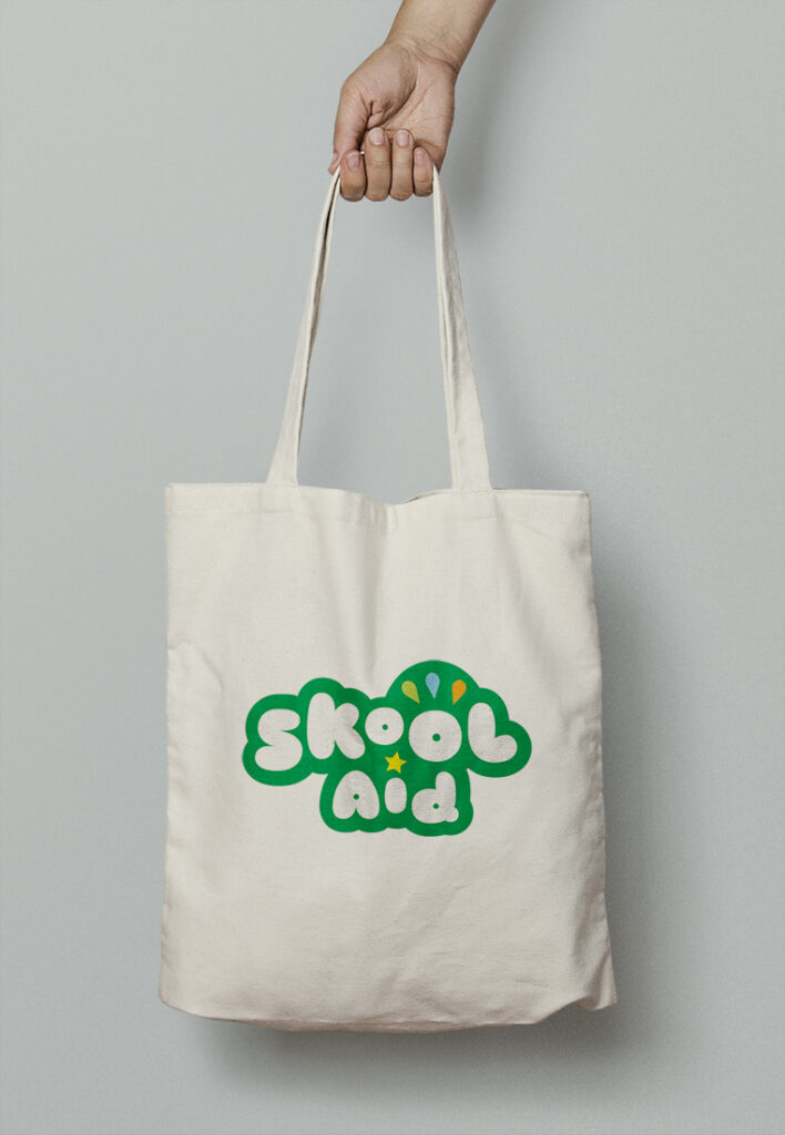
SkoolAid first began as a summer and after school enrichment program for elementary school children. Their branding needed to reflect the fun spirit of their work to both kids and parents.
In this design, colorful droplets are an abstract nod to the sports aspect of their programming, and a gold star represents other types of enrichment and achievement.
The colors are intentionally vibrant to lend to the youthful look of the brand—but they’re also more customized and modern than traditional primary colors.
The colors and icons paired with the bubbly lettering result in an identity that is as playful as their work!