Alpine Roofing approached Registered Creative to refresh their identity when they found that their illustrative logo wasn’t succeeding in marketing. The owners chose the company name because of their Swiss heritage, and their existing logo hearkened back to that by including both the Matterhorn and Swiss cross. With all those visual elements already in play and not much room left, their name was essentially squashed in at the bottom—small, and hard to read. While they knew their existing logo wasn’t working, they didn’t want to throw everything out and confuse their existing customer base. We helped them find a better balance by keeping the elements that worked in their logo, and reworking what didn’t.
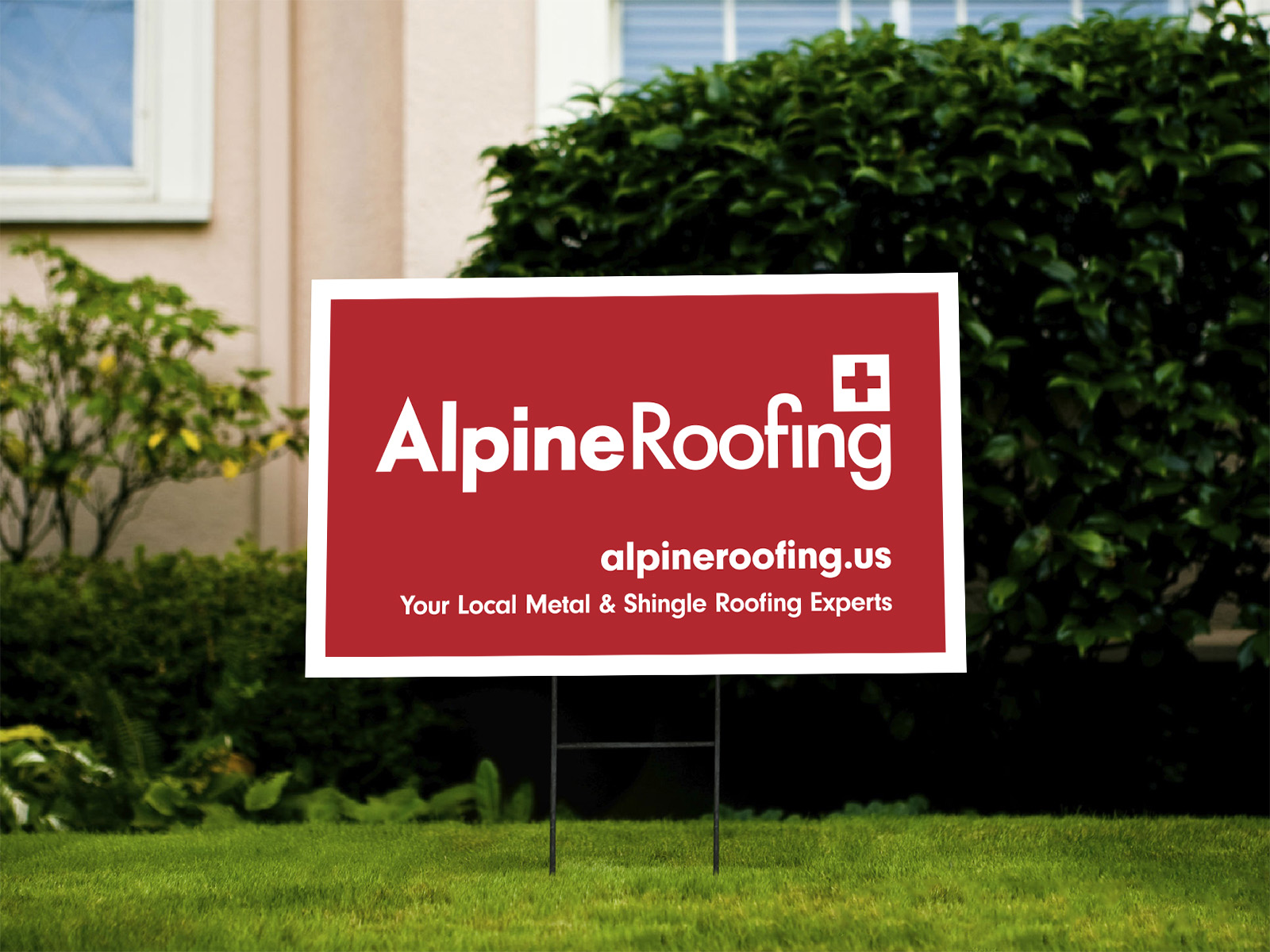
Our inspiration began with Swiss Style design. If you’re unfamiliar, here’s a brief history: Beginning in the 1920s, there was an era in design known as Swiss Style. It had a huge influence on modern design aesthetics (including architecture), and we felt it could tie in very nicely with the Swiss aspect of Alpine Roofing. Swiss Style is very grid-based, type-focused, and intentional with alignment points in terms of layout. It’s known for clean, geometric, and often bold typefaces. So, we ran with a more modern typeface that fit that concept (and with an ‘A’ that felt like a mountain peak), and carefully balanced the Swiss cross at the right edge of the word ‘roofing.’ We felt that keeping the Swiss cross would be an element that would help set them apart from their industry competitors. As you can imagine, roofing companies tend to stick to logos that include roofs. While it’s a logical choice, it doesn’t allow a company to stand out and stick in the minds of potential customers.
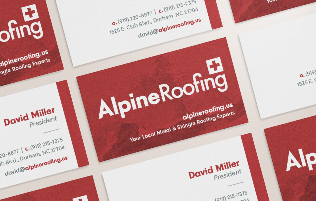
The bold red color was also a standout element, and we tweaked the original silvery gray to one that had more visual contrast on white backgrounds. From there, we developed their brand standards with a full working color palette and collateral typography guidelines. We also showed them ways they could use the image of the Matterhorn without having it in the logo—like using it as a background graphic on business cards or other materials.
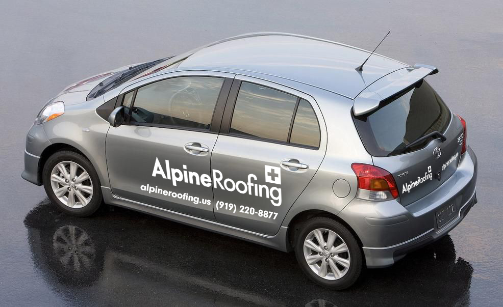
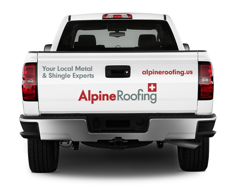
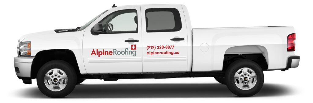
They also came to us for various print materials after the brand rework, including vinyl art for their vehicle fleet, business cards, and more. If you’re ever in Durham, NC, you might see some Alpine trucks on the road!