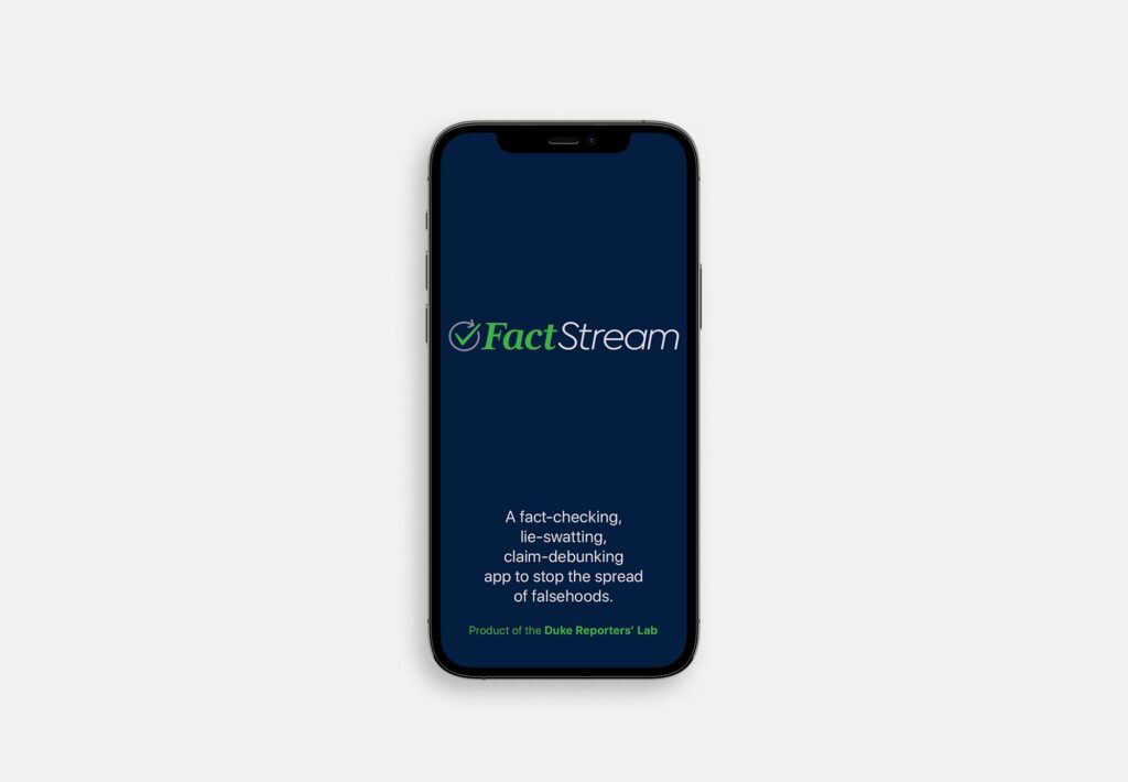
Before TV outlets adopted live, on-screen fact checks, Duke Reporters’ Lab (DRL) built a fact-checking platform called Squash. To showcase it, DRL needed a public-facing app. The app would leverage Squash to allow users to read fact-checked statements in real-time during live speeches, debates, and other political events. That app was called FactStream, and DRL partnered with PolitiFact, FactCheck.org, and The Washington Post to get it off the ground. Our role was multifaceted: Develop the brand and provide detailed visual guidance for the user interface and experience.
It All Starts with Research
The DRL team had already begun work on product naming but wanted our input before moving forward. We had a brainstorming session to run through the pros and cons of each option, narrowed it down to a couple of selects, and then ran a trademark and URL check. We needed a name that would be clear, marketable, and didn’t overlap with any competing products. “FactStream” checked all those boxes.
Testing, Testing, 1-2-3
Logotype
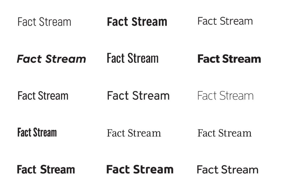
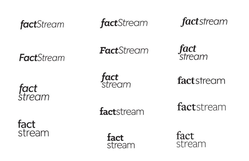
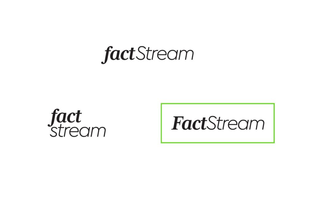
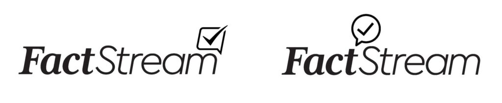
Once we had a name, we started pushing it around in different fonts and layouts. DRL wanted something that would feel modern and techy to represent their work. It also needed to be professional and timeless since FactStream would be working closely with well-established media outlets. After initial sketches, it was clear the best way to achieve those goals would be to combine a modern serif with a sans. Serifs are classic and timeless, and the right sans serif can have the same qualities and bring a more modern touch.
Icon/Mark
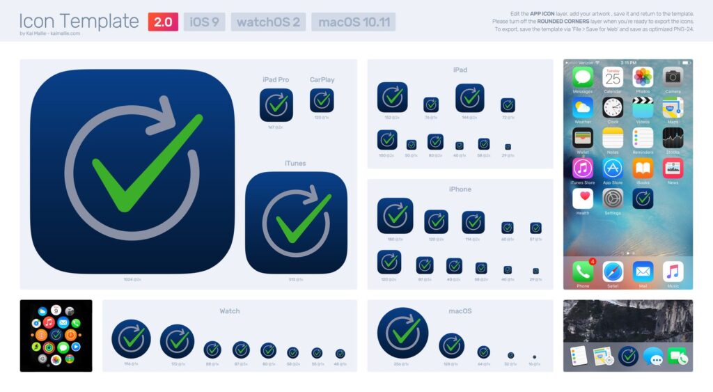
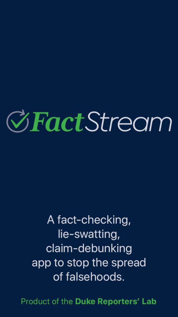
With the logotype resolved, the icon was next. We erred on the side of simplicity for clarity—the app icon was on our mind from the start. With a new product like this, the icon needed to reinforce what the app provided. Ultimately we landed on a checkmark surrounded by a circular arrow—like one might find on a loading screen to indicate progress. The thinking was it served as an indication of the, hopefully speedy, checking process.
Color
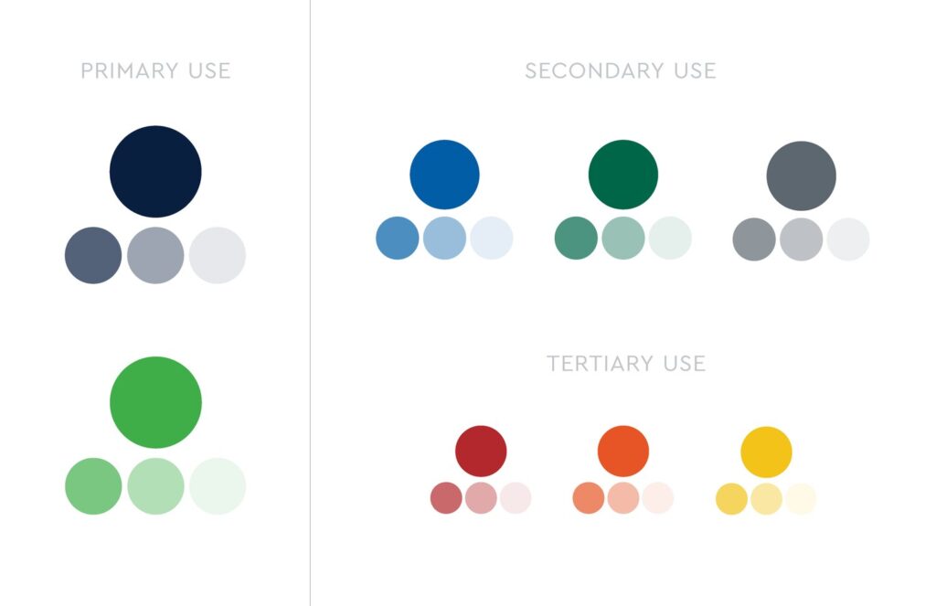
The app branding needed to connect to the Duke system in some way—a common constraint for many Duke projects. So, we referred to the Duke palette—sometimes using direct duplicates, sometimes slightly modifying for a more cohesive look—and created a full palette that still felt unique to FactStream.

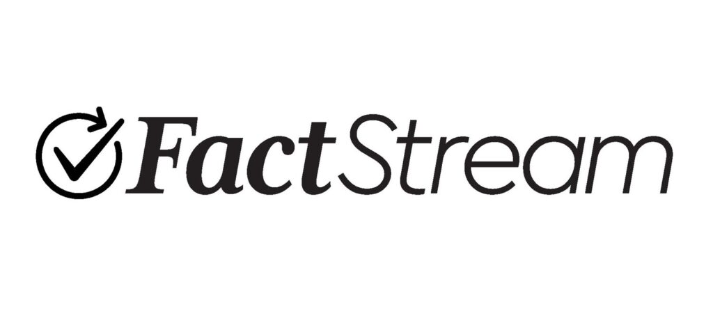
Refining to Final
For the final iteration of the logo, we used the app splash screen and icons as crucible pieces to confirm everything was performing as expected.
Branding the User Interface
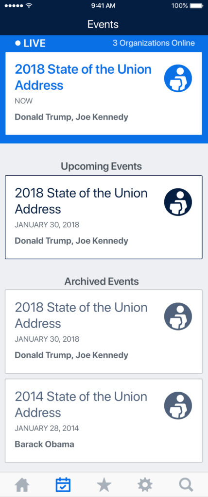
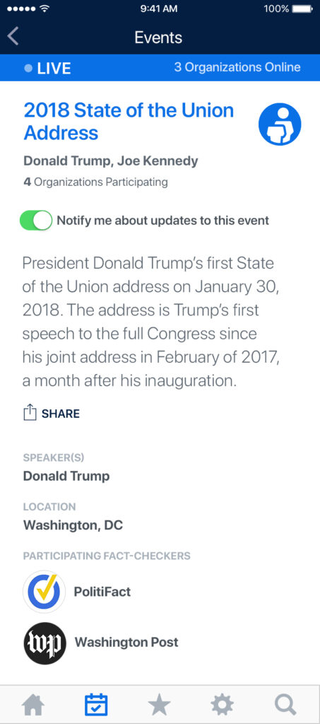
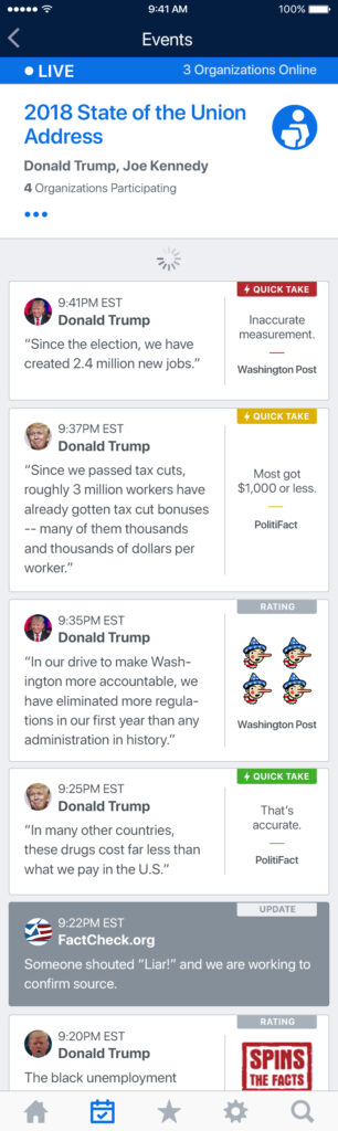
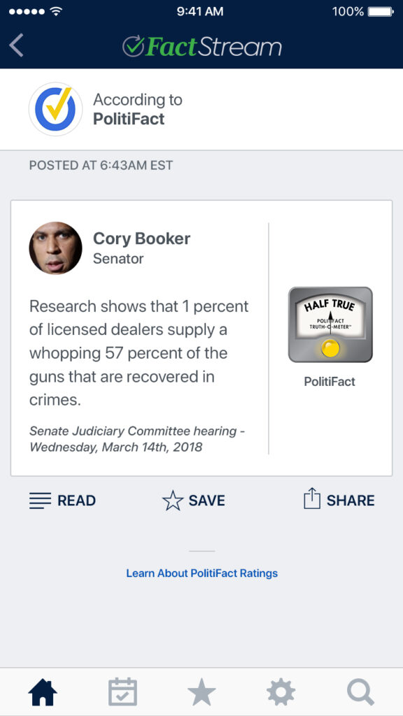
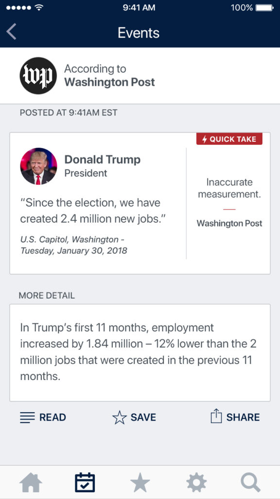
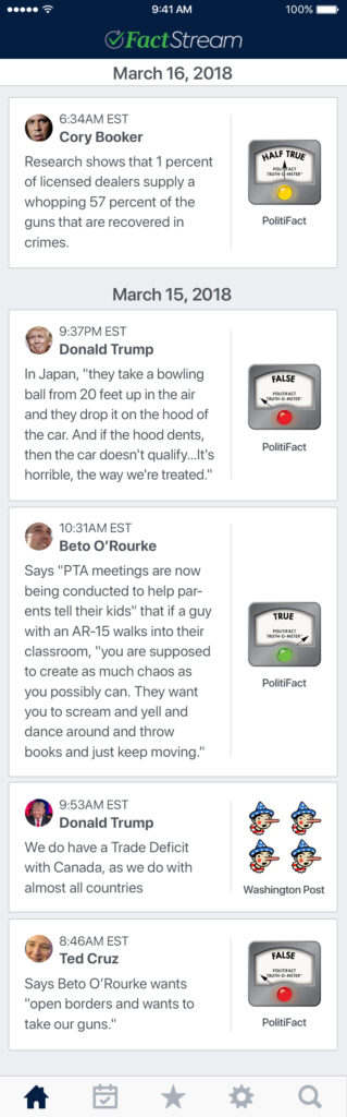
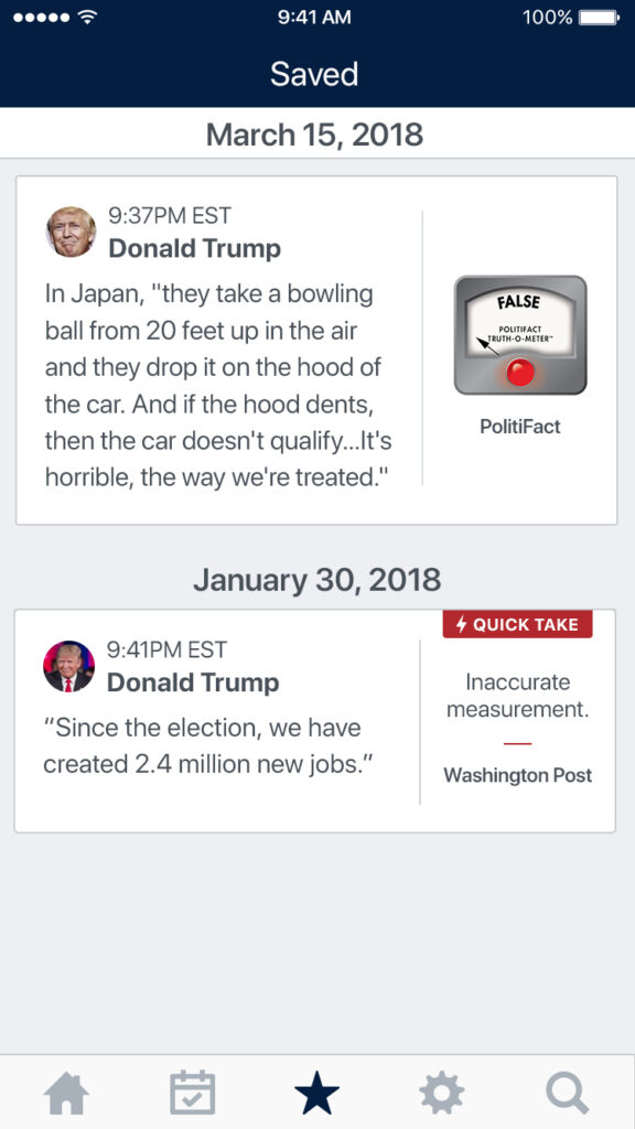
User experience is part of any app’s brand—and vice versa. So, as we worked through brand development, we simultaneously worked with the DRL team to wireframe and conceptualize the flow of the UX. Branding the UI was crucial to the app’s usefulness. Another complication was each fact-checking partner’s system of visual rating icons on fact checks. We found ways to tie those in without sacrificing the FactStream look and feel.
We marked certain statements as “quick takes” if they needed more time to be thoroughly vetted and styled as many screen views as possible to guide the developer as they continued to hone the app’s functionality.
The voice is one aspect of a brand that’s easy to gloss over on a sprint to launch. It’s challenging work—thinking about what a brand says and how it says those things. The DRL team was all in from the start to let the voice represent the team working on it. Top and center on the website and the app splash screen, you get a sense that there’s a personality at work here with clear statements like:
“A lie-swatting, claim-debunking, fact-checking app to stop the spread of falsehoods.”
The March of Progress
DRL has wound down its work on Squash, and the platform is going out as a remarkable success. It’s shown what a best-of-breed, real-time fact-checking platform looks like and where things need to go to raise the bar. Together, Squash and FactStream have seeded many new projects across the international fact-checking community.
Bill Adair, director of the Duke Reporters’ Lab, has an excellent write-up on Squash’s entire run over at Poynter. It’s a great read and highly recommended.