Bland Landscaping has been in business since 1976‚ and in that time their identity has remained strong. In 2020, they approached Registered Creative for a website overhaul and an identity refresh.
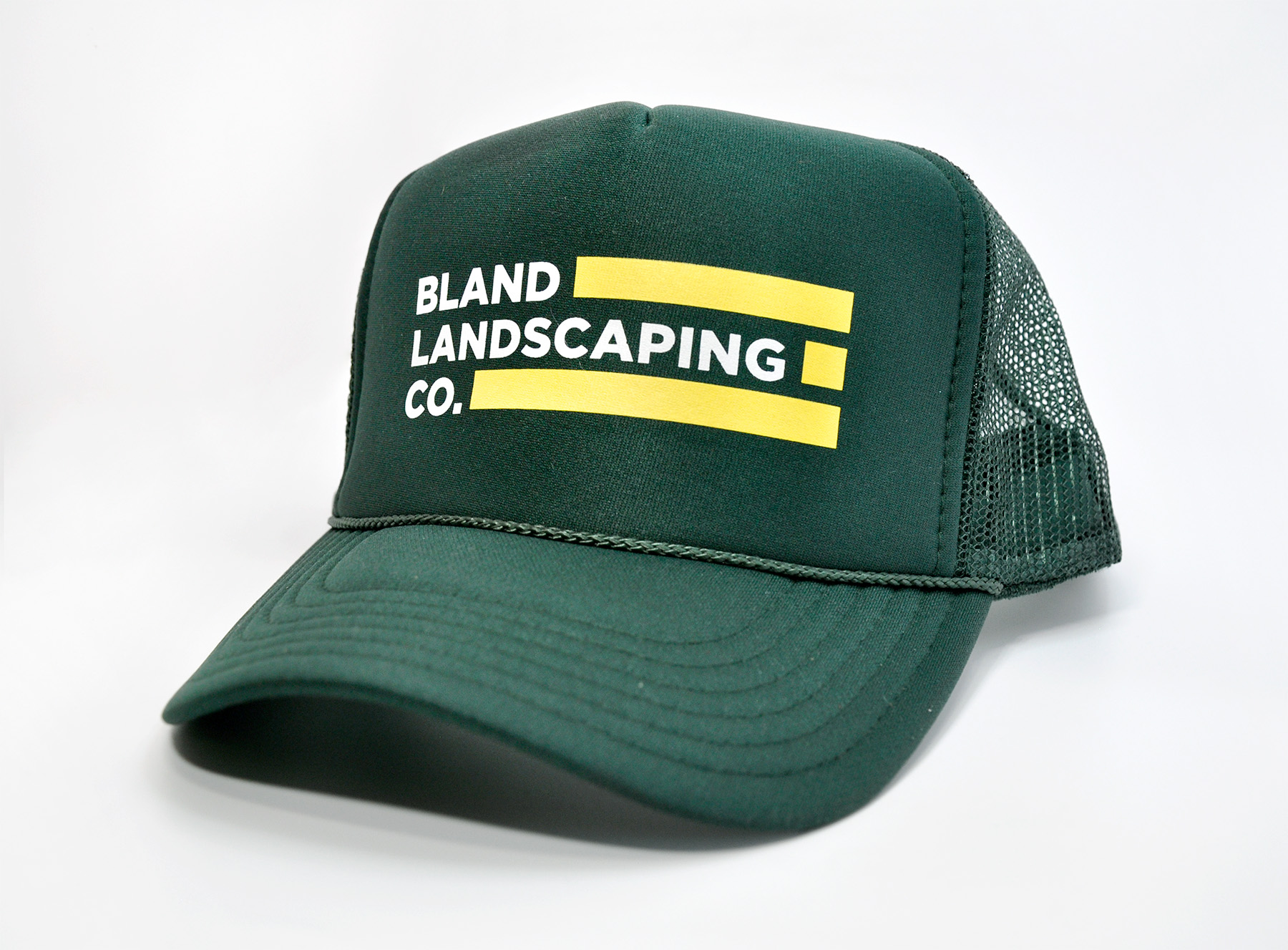
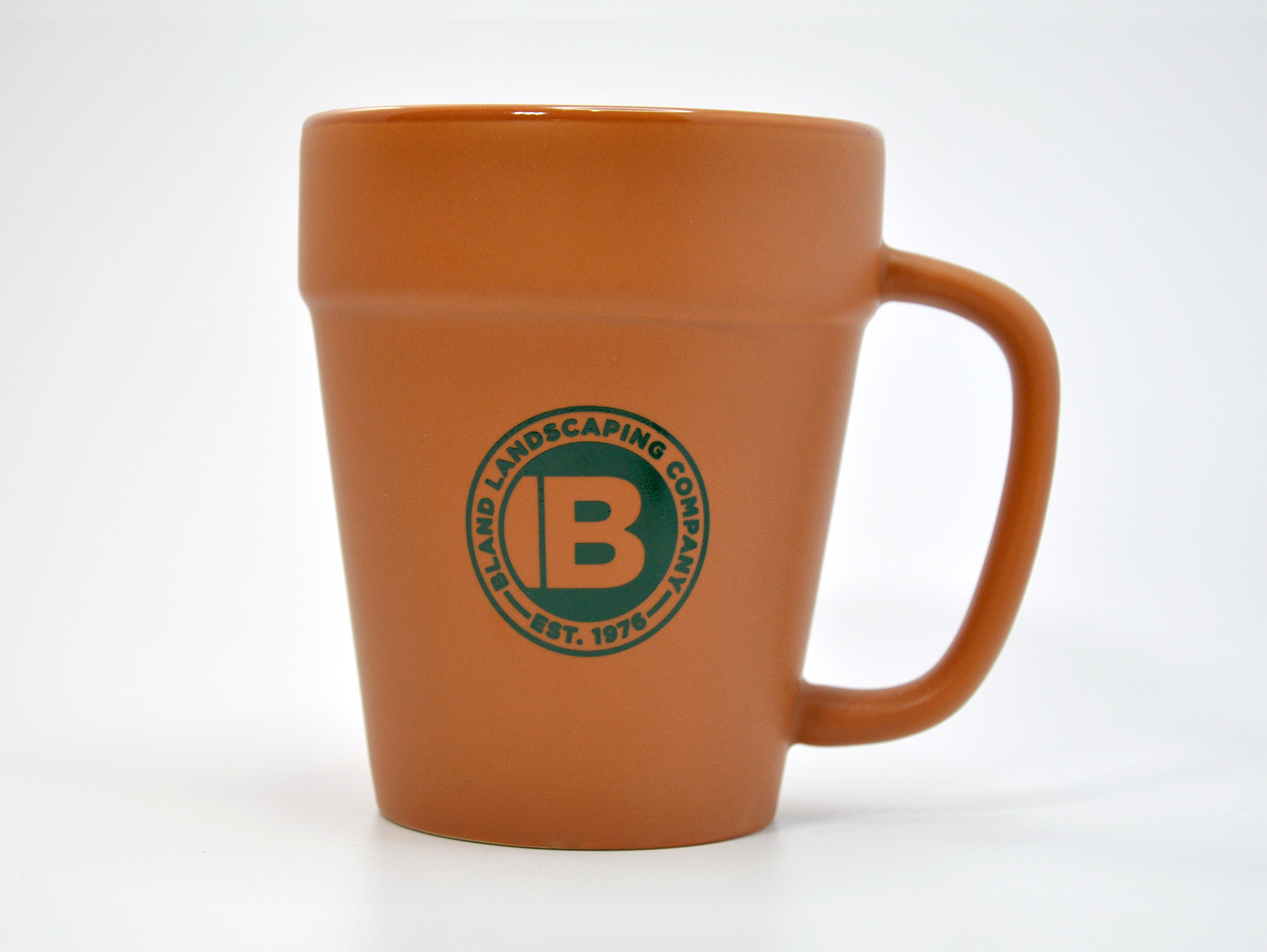
The identity refresh had simple goals: keep the look of the original ID, but update the assets for improved use in both print and digital landscapes. One of the outcomes of this task was the development of a circular icon, and a circular seal. These additions gave their identity more flexibility; where a horizontal logo doesn’t scale legibly (social media avatars, as one example), a circular icon or seal will do exactly that. The seal can also be used to diversify many of their materials, including the company-branded swag that employees wear on-site.
In addition to developing the seal, we modified the original logo. The original logo was very long, with a bright yellow that didn’t always show up well on screen or in print. We were able to reduce the horizontal length by taking out the abbreviation “Inc.” and selected a similar font that scales more legibly. We also tweaked the colors to be a little easier on the eyes, a little closer to the classic visual look they were aiming for with the brand refresh.
With these assets ready to go, we pulled together a full brand guide that includes a robust color palette, collateral fonts, and guidance on how to deploy it all consistently. Visit BlandLandscaping.com to see it all in action.