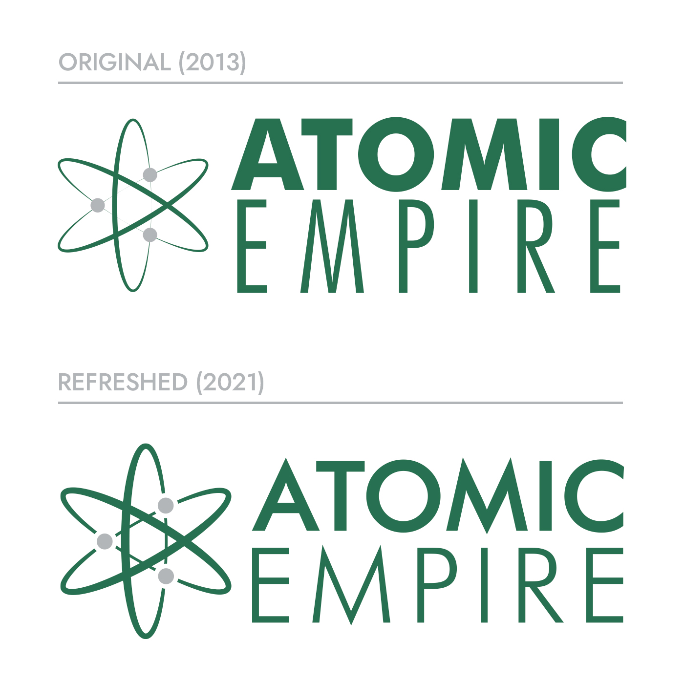
Atomic Empire’s foundational branding was first developed in late 2013. As digital media became more prominent and responsive designs far more necessary, they realized it was time for a brand refresh. Why a refresh and not a complete overhaul? Atomic Empire’s loyal customer base feels right at home with the branding from 2013. So we decided to work together with Atomic leadership to figure out what elements we could improve upon without losing the existing brand equity.
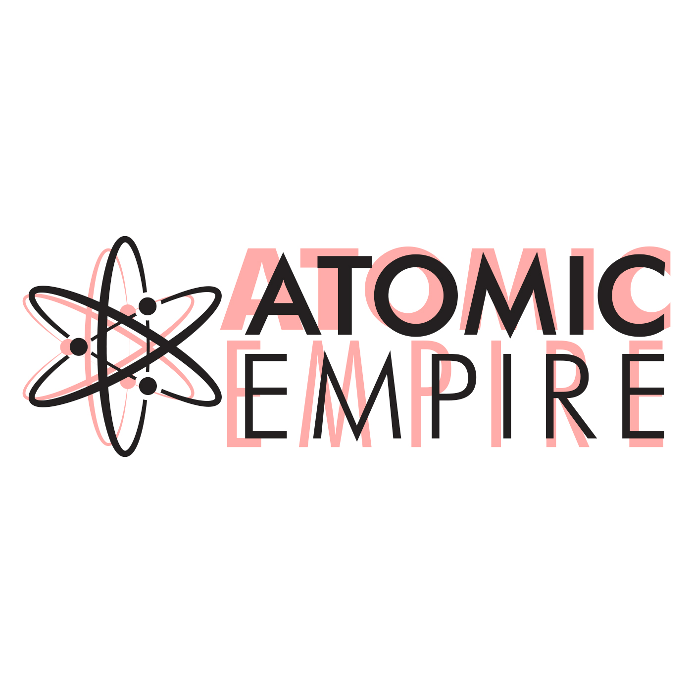
We started by selecting a new, more scalable font choice for the logotype. Then adjusted the line weight of the mark for improved contrast and reworked the proportions of the icon to the logotype. The result is they now have a choice of logo lockups: a horizontal layout or a stacked vertical layout. A flexible identity kit is extremely advantageous, whether you’re designing for print or screens. With more options in your toolkit, you can maintain a cohesive look no matter what.
Old vs. Updated
When comparing the original logo to the refreshed version, you can see how the line weight was adjusted from wispy to sturdy—from too much contrast to more uniform. The difference is even easier to spot if you overlay the original and refreshed versions. Subtle changes can make a big difference!
Color & Type
Next up was a color palette and collateral typography refresh. Typography goals were easy: We extended the look of the logotype into their collateral font options. It reinforces the look of the brand by doubling down on the commitment to the new type.
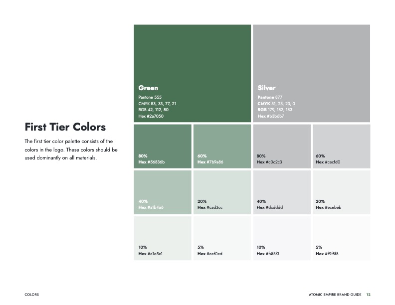
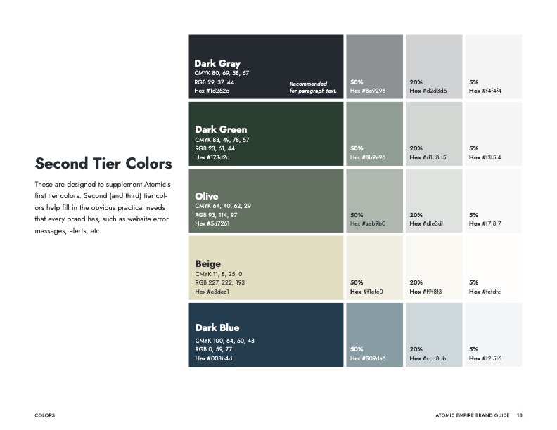
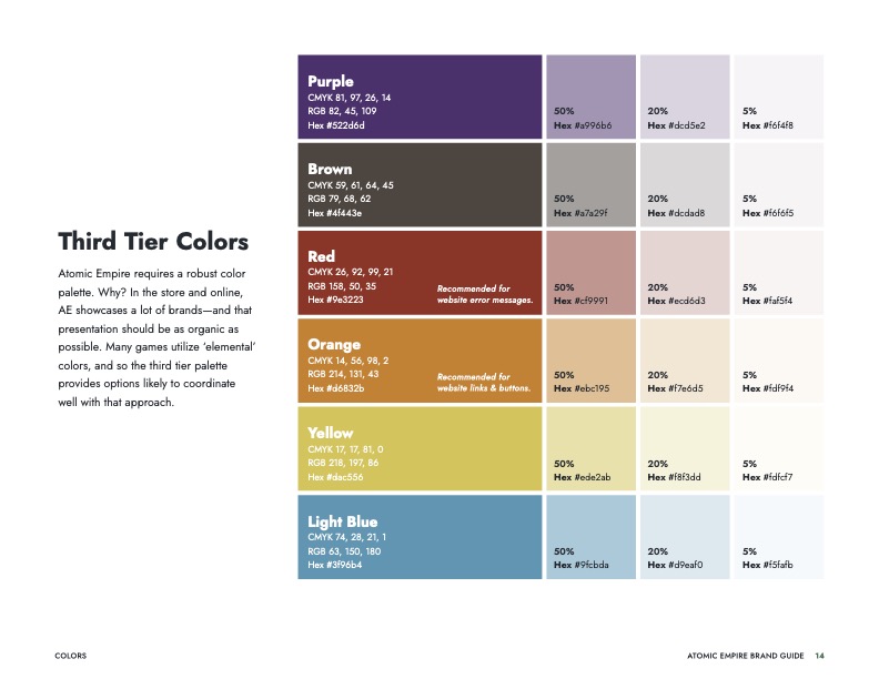
The color was more complex. Atomic often advertises well-known product brands sold in the store, so they needed a robust palette to create graphics that won’t clash with those brands. We set them up with a suite of colors: first-tier (what’s used in the logo and most commonly deployed), second-tier (a selection to compliment and extend the range of the first tier), and third-tier (a range of extras that work well with other brands).
Test and Test Again
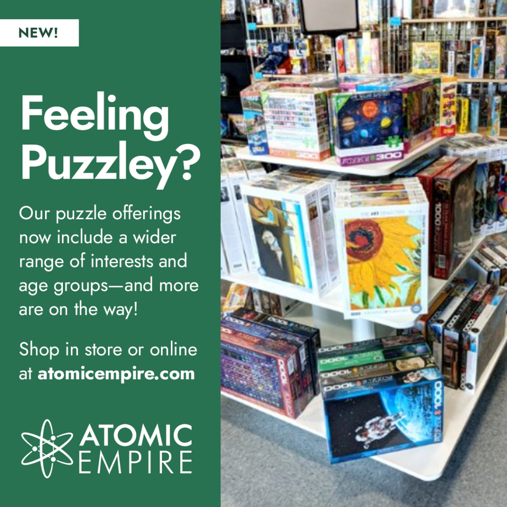
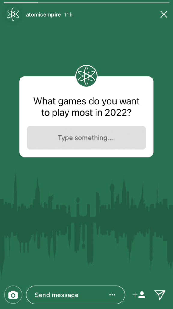
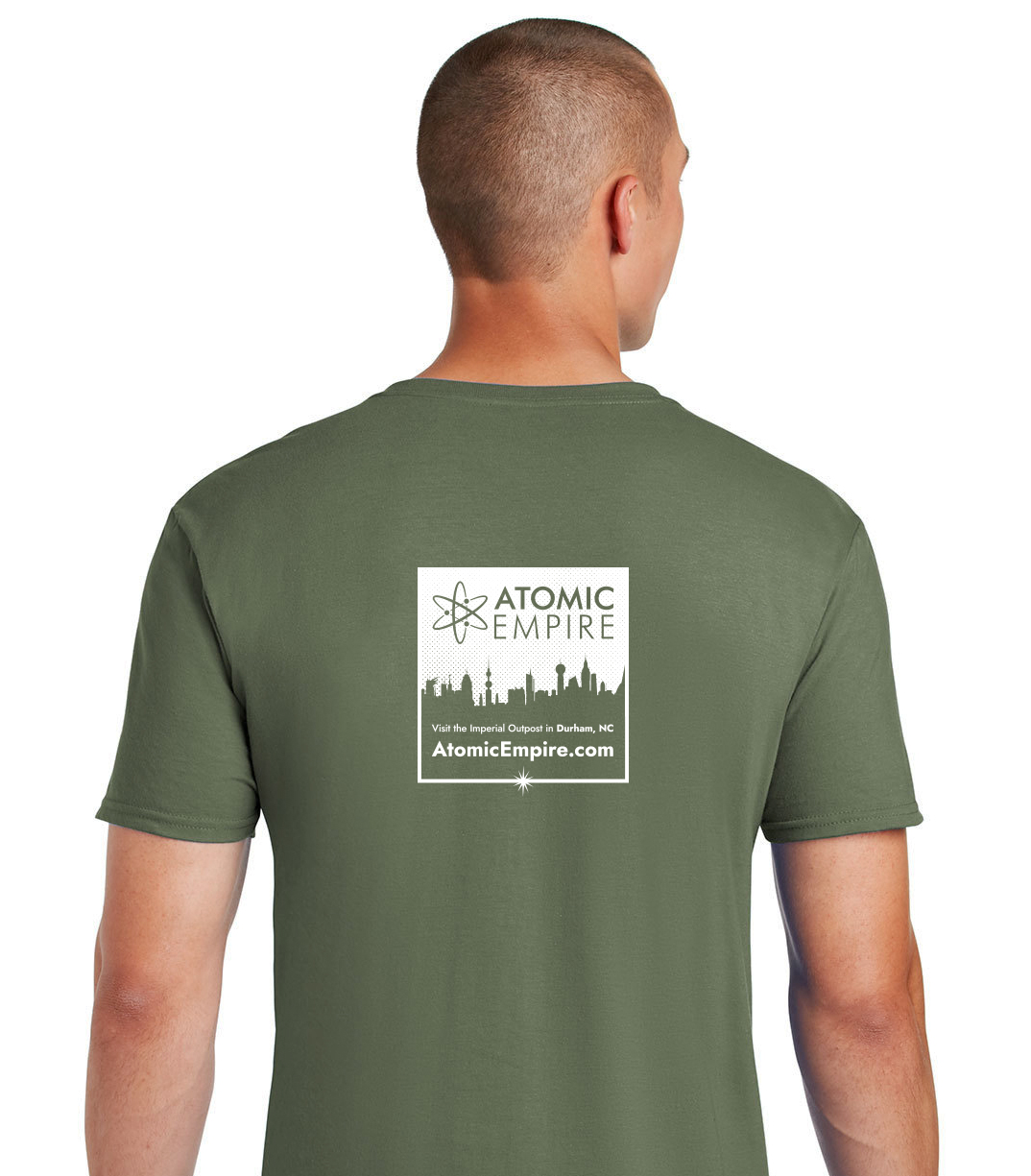
With the new branding in place, we used social media templates as a crucible for the new work. We spent time polishing icons and textures that have been used in their print materials for years, and writing rules for usage so the in-house team can deploy them consistently across multiple platforms.
The end result is an informative, easy-to-use set brand guide and graphic assets. The new look is still in the rollout phase, so keep an eye on atomicempire.com for more!