When looking for places to volunteer for racial justice, I came across Triangle Showing Up for Racial Justice (TSURJ) and started attending virtual meetings. It turned out that one of the local chapter leaders was a former client of mine, and I volunteered some design time to craft an identity that would look professional on social media, websites, and in print. A strong identity can convey an organization’s reputability quickly, and in their case hopefully encourage more community members to follow, volunteer, and donate.
Why We Refreshed the Brand
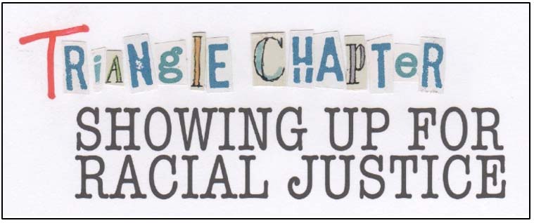
The original TSURJ logo was really more of a graphic than a logo. It didn’t perform well in modern spaces where brand presence is crucial—such as social media platforms, email newsletters, or the website.
By rebranding, we had the opportunity to create a cohesive brand identity. A rebrand is always more than just a logo refresh: it’s setting rules for color, typography, and more. In this case, the TSURJ communications team can now reference a brand guide for consistency and design confidence—no matter what their design skill set.
Accessibility
The TSURJ team relies heavily on volunteers, and their assets needed to be easy to use. The new assets can be deployed using free, online design tools, like Canva. The fonts can be downloaded for free from Google Fonts. And the final color palette is documented with all forms of the color codes for print and on screen. This makes the brand accessible to all team members, promoting brand longevity and a unified look.
I also made sure that the final files, fonts, and codes bolster accessibility to our online audience: the fonts are clean and legible, and the colors pass industry standard contrast tests for low-vision users. For an organization working toward such an important cause, communication accessibility is crucial.
Parity
Around the same time, the parent organization had just undergone a rebrand. So, we borrowed from their color palette and type styles for visual parity.
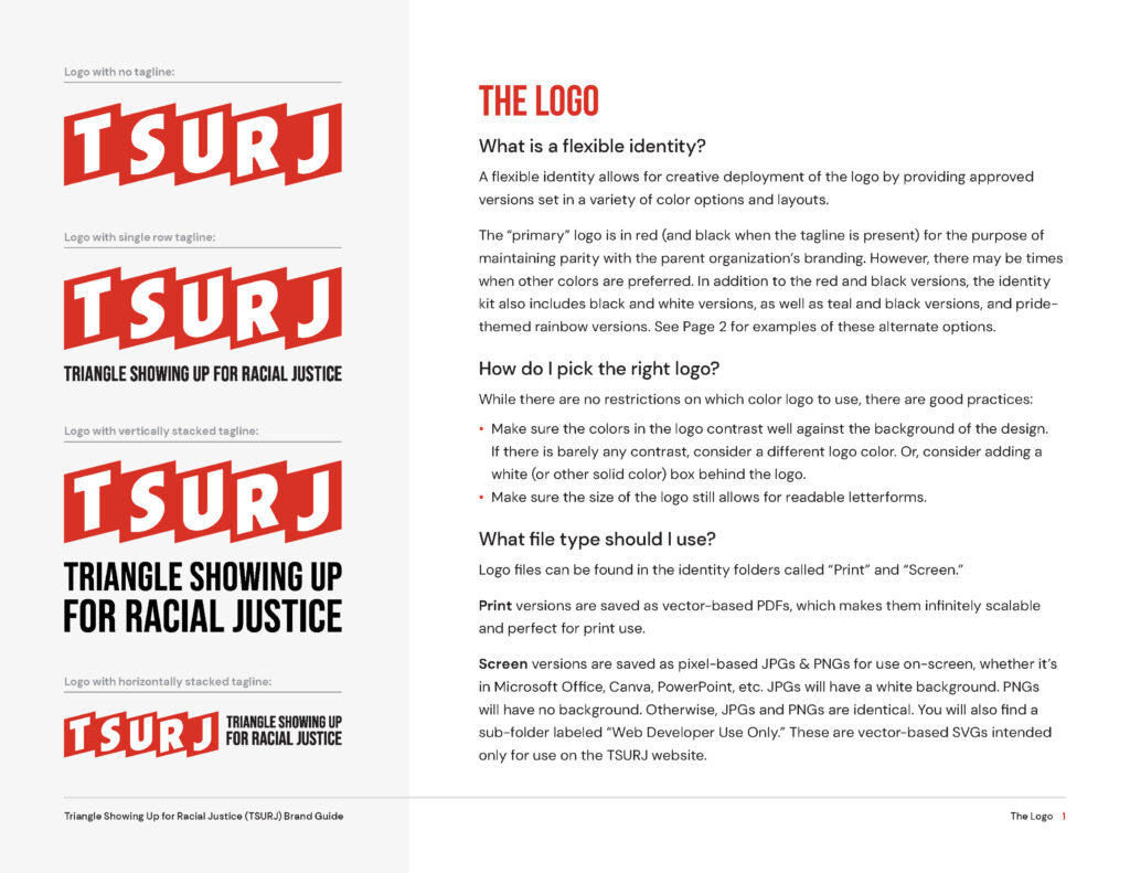
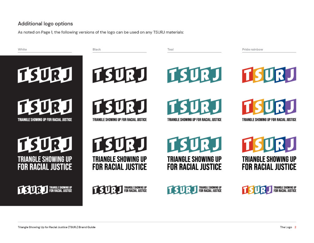
The TSURJ logo, however, is unique and bold. The shapes reference multiple protest signs next to each other. It’s also modular; it has several versions that either do or don’t include a tagline, full name, etc.
See sample pages from the brand guide below to get a glimpse of the brand work.