A friend and fellow artist, Josh Norman, was commissioned by punk band Hey Revolver to create custom art for use on shirts and other band merch. He then contracted me to digitize his drawings and turn them into vector art—making it possible to scale the art up or down in size with no loss in resolution. Hot tip: it’s way easier for your print vendor to work with vector-based art than pixel-based art scans. If you want to geek out on how vector art works, Adobe has a great explainer.
You may think that digitizing art is quick and simple. That can be the case if you’re working with a single color image without a lot of complexity. There are, in fact, tracing options in design programs that automate the effort. But the more complex the art, the more cleanup is required. Art with a variety of line weights, lots of curvatures, multiple shapes and textures is best traced “by hand.” (By hand via mouse or pen/tablet, really.) Auto-tracing the art for this project, for example, would result in a loss of most of the fine lines and curves. A blobby mess is not ideal! And it doesn’t allow for working in layers that make it easier to focus on particular design elements. The TL;DR is that this art couldn’t be digitized automagically.
The first step was coordinating with Josh on the art. As is the case in many art and design projects, the first draft looked a bit different than the final. The word “Hey” was originally drawn to fit inside the gun handle, and the letterforms on/outside of the barrel varied more in height.
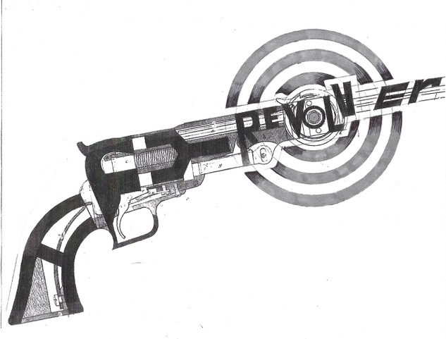
The original art is incredibly inventive, but the band wanted more readability for maximized name recognition. It’s a fair ask! If you’re a local brand, you don’t have the instant recognition that national or international brands have. You have to get your name out there first, and then break the mold. So, Josh left the base layer of the revolver in place and restyled the letterforms to fit over it rather than directly inside it.
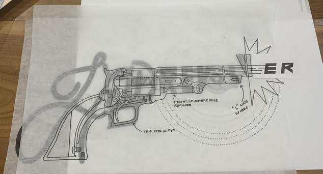
From there, I hand traced each layer in Adobe Illustrator in black and white. Working in black and white helps me hone in on the details of each layer without getting distracted by color, allowing for a more polished result. Every designer is different, but developing a production process that works for you will make it so much easier to spot areas that need adjustments. Why? Digital art is not as forgiving as traditional media like pencil or ink—even the tiniest flaws or differences in pressure that may be imperceptible in a drawing can really stand out in a digital form. One isn’t better than the other, just different.
Once I got through the layer tracing process, I worked with Josh’s art direction to fine tune. He wanted the background target to look intentionally misregistered with a dot screen effect, giving it some separation from the smooth quality of the rest of the art. And the very last detail was adding color. Originally, the plan was to feature 4-5 colors. But being in the design field for over a decade meant that I knew that would be a costly buy for the band. More inks means more screens, and more fees. For most clients, capping the inks at 2 per shirt design is the right price point for good retail margins on shirts that don’t break the bank for buyers. So, we picked two from the original palette that offered good contrast with emphasis on the band name.
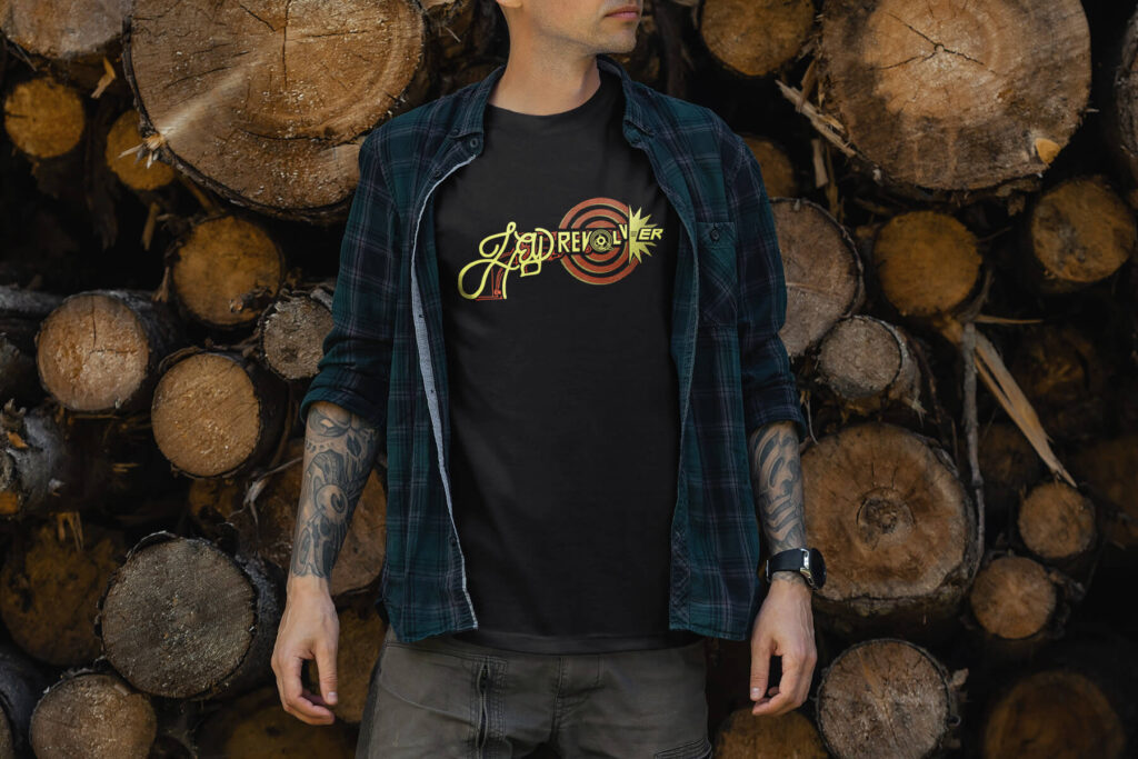
All in all, it took around 10 hours to digitize the art. The band loved it, and Josh and I were happy to be able to collaborate on something unique and fun that satisfied the client!