Members of the HALO 22 built out Roger Canaff’s personal brand and first website more than a decade ago. Those early efforts focused on building an online presence to support his public speaking and advocacy work in protecting women and children from violence.
As the years went on, Roger began writing fiction—drawing from his experience as a special victims prosecutor. As his focus shifted from public speaking to writing, his publisher pulled a book-specific website together for him.
It was time to blend the two so Roger could have one place to share whatever he’s doing now, what’s next, and make sure all of his prior work remained available.
Roger didn’t want another thing on his plate—he wanted a website that would be reliable and available when he needed to leverage it around a book launch. That made it clear we’d look at a hosted option. We reviewed the content and features he’d need, quickly settled on Squarespace as the platform of choice, and got to work.
Building a Strategy and Blending Content
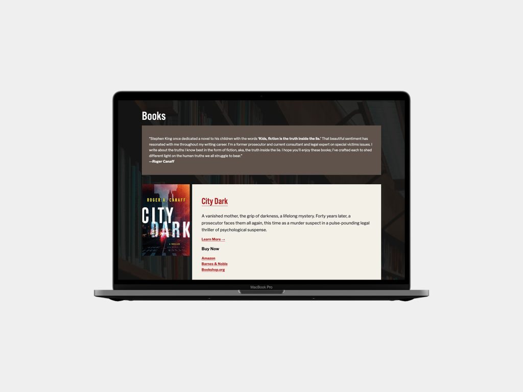
Roger’s focus is on his writing, so first and foremost, we wanted to lay out an information architecture (IA) that would allow him to pursue his writing across four existing books and a series in an organized way.
This meant working through a category and tag strategy that would support that. With our roadmap in place, we set off to collect the content.
The book-focused site was light enough that we did that manually. This was good because the team wasn’t as familiar with the material. This process allowed us to see places to improve the IA—slower can be better.
The original site had posts going back to 2009 through 2018. It was an older WordPress build, and we could export the whole thing and import it into the new site.
Design Refresh
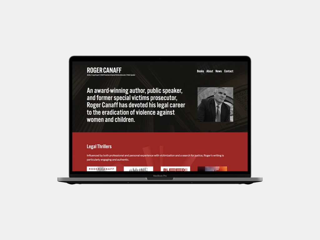
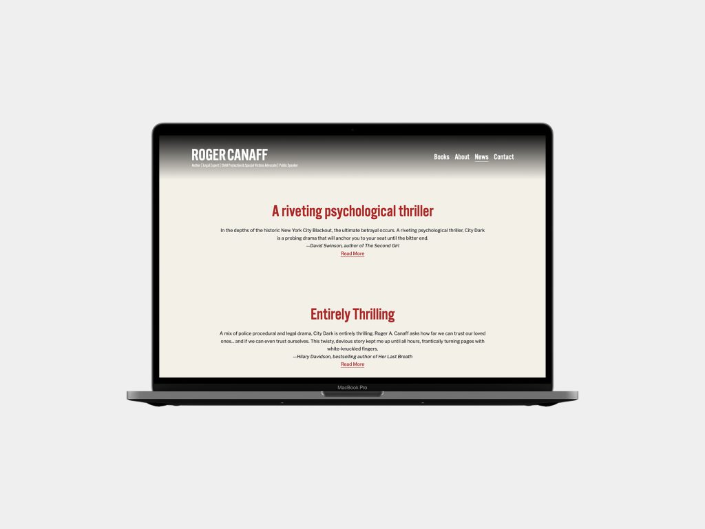
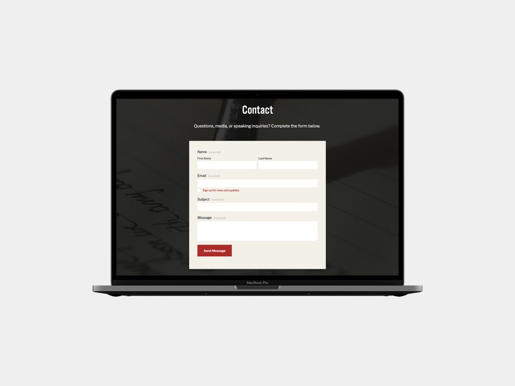
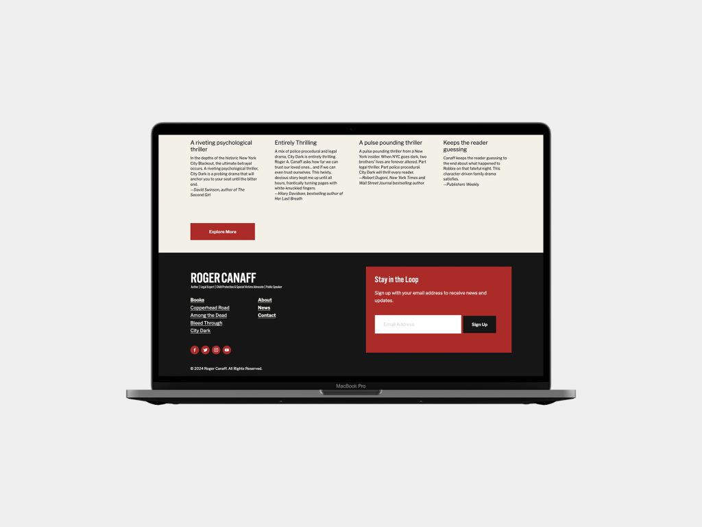
We started with the old brand identity with plans to refresh the collateral typography and blend the color palette with elements from both websites.
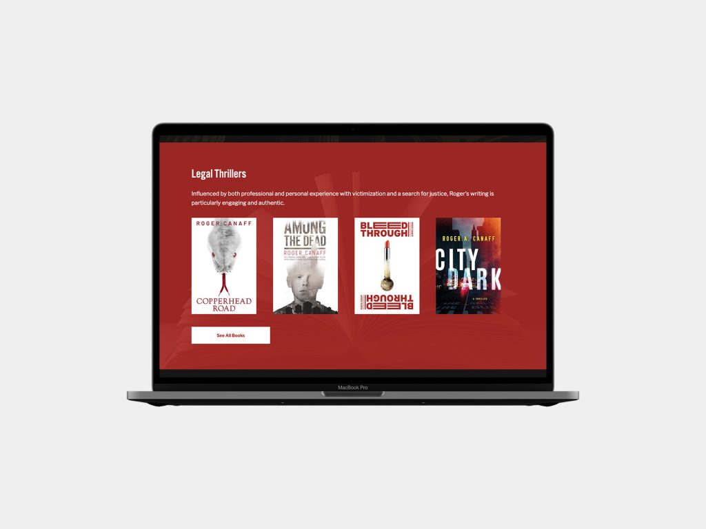
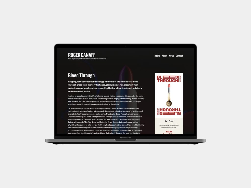
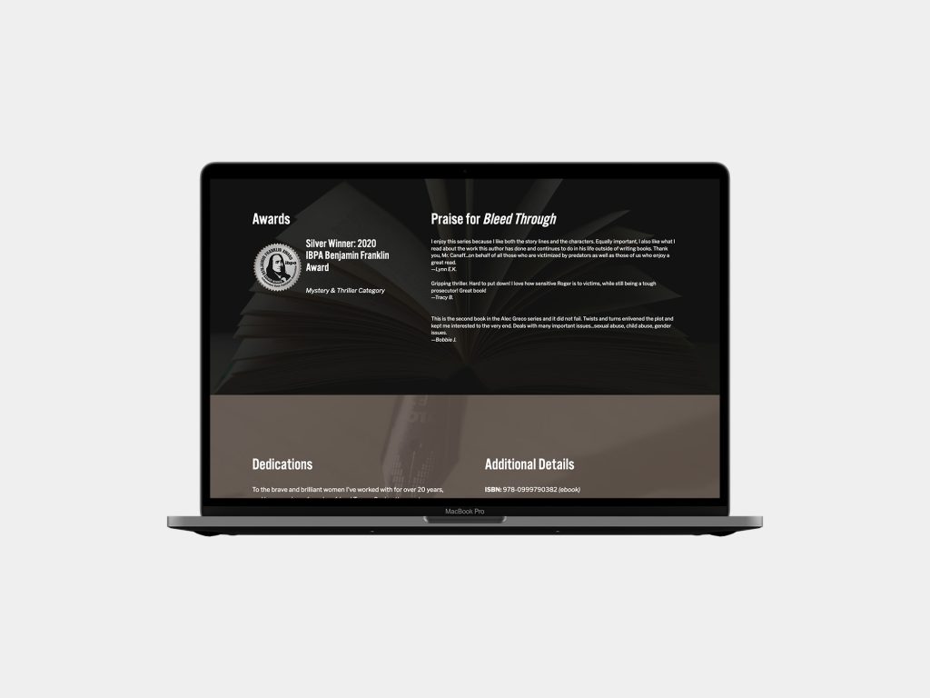
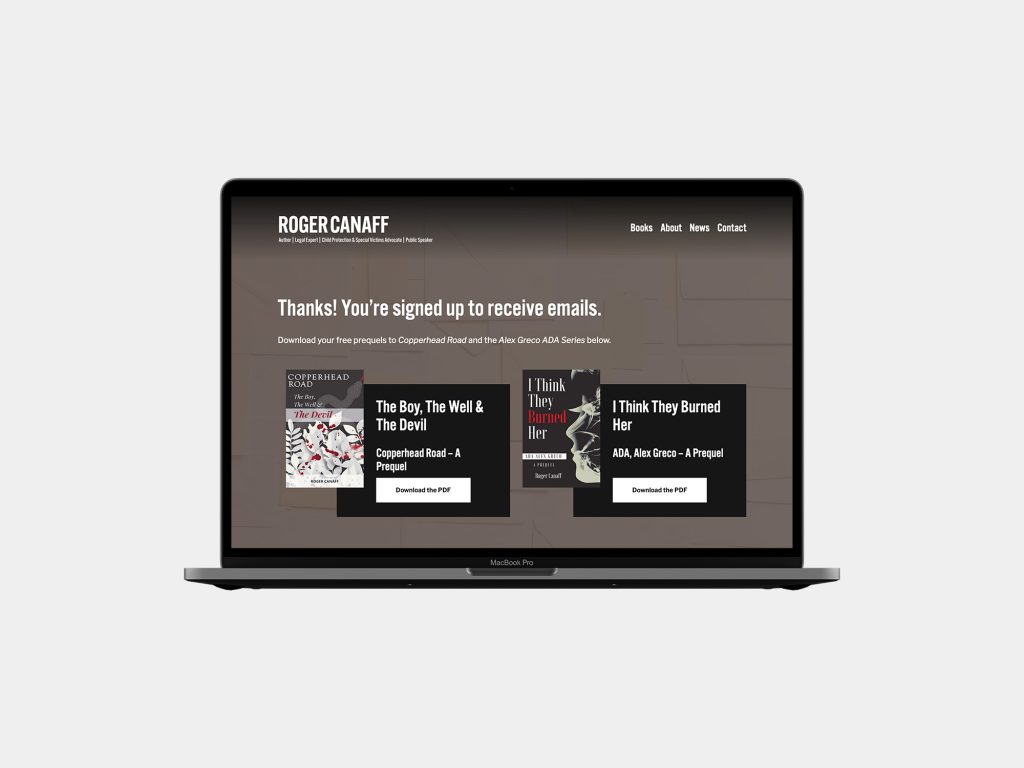
With four books and two prequels, we had far more photography to take inspiration from and leveraged that into the book pages to build on the tone set for each title.
The new site is the best of both.
Timeframe
Above, we mentioned that sometimes slower is better. In this case, slower was also faster.
Once we got rolling, it took less than three weeks to get the site built and launched. That’s a combination of an engaged client and the decades of experience the HALO 22 could bring to the project.
We can’t wait to see how this new site gets put to use.
This project was produced at HALO 22. See the original post.
Art Direction: David Spratte, HALO 22
Design: Emily Combs, HALO 22
Development: Jennifer Bedell, HALO 22