In the spring of 2022, we began doing small projects for Pyxera Global—a bit of print and some content work. Within a month, the comms team came to us regarding their website. In the works for over a year, the project was stalled with another firm.
With the leadership team getting justifiably frustrated, the comms department wondered if we could complete it in three months.
The response was something along the lines of, “We can figure something out. It’s what we do.”
You learn a lot during a pandemic.
Pyxera Global works across incredibly diverse fields with partners spanning the public-private spectrum. The pandemic upended the processes that have fed their long, storied, and successful 30-year history.
The comms team recognized that part of their problem was their website. Simply put, it wasn’t doing the work it should to help people discover what Pyxera Global does and how the organization could help them.
At its core, it was a website built around an outdated mindset. Effectively it was an online brochure. To be fair, before 2020, Pyxera Global created its connections and landed projects through other means.
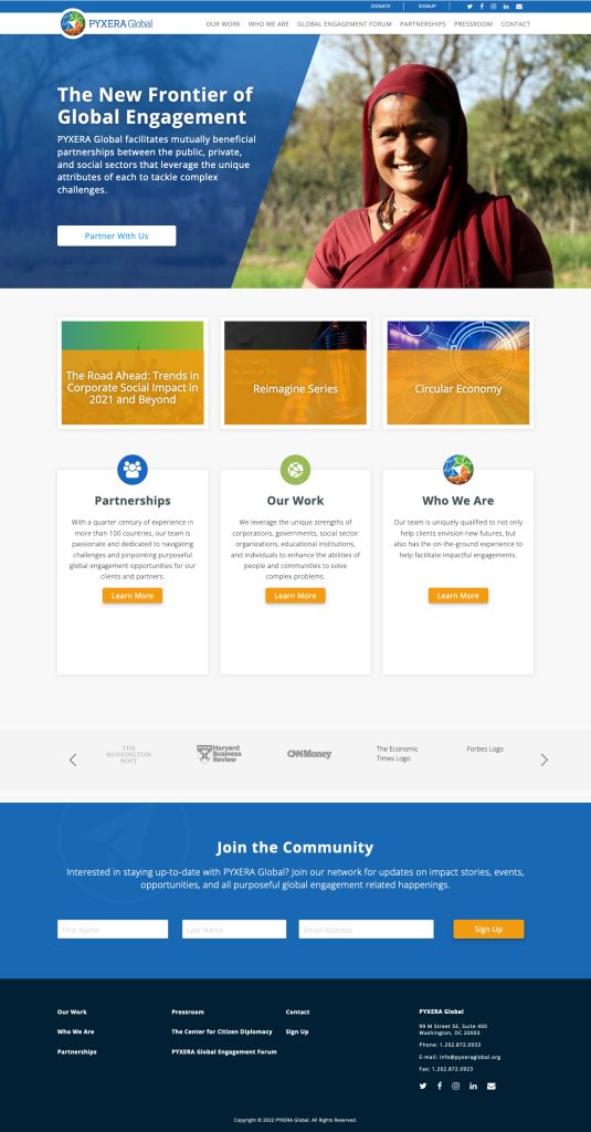
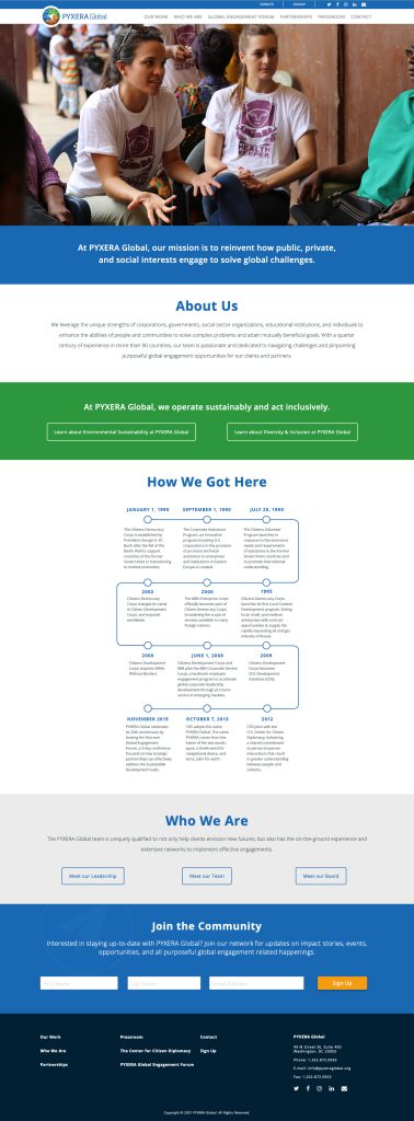
Sample screenshots of Pyxera Global’s original site.
The old site hosted a blog, but it was a silo that didn’t interact with or support any other part of the website. A global pandemic that stifles your traditional networking methods puts far more strain on the website.
Furthermore, an organization’s website is a window into the organization itself. A static website makes its organization look stagnant.
If, at first, you don’t succeed…
Like many projects, the care that goes into the early preparation work tremendously influences a new website’s success.
Here, preparation means taking the time to understand what the client does, what they need to remain successful, and how to organize the information so visitors can find and understand it.
Prior efforts on this redesign jumped from developing personas to laying out wireframes. We understand why that can happen, particularly when faced with sliding deadlines. In that scenario, the temptation to move right to the visuals—a wireframe or render—is strong. We also know that’s a short-term fix that scratches the itch to show progress.
Moving to visuals early can also send you around in circles and take longer. Working through a website’s information architecture (IA) first lays the groundwork that makes layout and design move much faster because you can proceed with high confidence.
A good IA compresses the wireframes nearly out of existence, and we can flow into a layout approach that integrates branding.
The Plan: Let’s try a phased approach.
Here we were, 90 days away from a launch date. We had a handful of user personas that the communications team felt good about and almost a dozen wireframes that were, at best, unreliable.
In the spirit of “real artists ship,” we suggested a three-phased approach.
Phase 1: Minimum Viable Website
Even a minimal website would serve the organization better than what it had already. Our chief constraint would be the deadline to launch. The second was to focus on the IA so we could build a strong infrastructure, establishing the new site as Pyxera Global’s publishing platform. Being able to lean on the website to populate posts to the home page and specific landing pages would make the site more dynamic and informative.
Observation: Put it to work.
In this phase, we’d have three months for the Pyxera Global team to lean on the systems we built and ensure that the custom post types (CPTs) and other functions worked as intended.
Observation would also provide a window to publish content that missed the Phase 1 launch.
Phase 2: Refine the UX—for everyone.
With six months of use, we’d have real-world usage information that we’d leverage to make improvements to front and backend functionality.
That three-step plan got all the stakeholders on board. We rolled up our sleeves and got to work.
Even the best plans rarely survive contact with the real world intact. That’s fine. Plans give us a starting point and a destination to hold while you adjust to conditions on the ground. Let’s get into how we adapted.
Phase 1: Light the fuse.
If we had a mantra for this phase, it would have been, “Missing the launch date is not an option.”
If we didn’t have enough of the content in time to build a CPT or a feature, it moved to Phase 2. If a chunk of content wasn’t finalized, we’d publish it during Observation.
In this regard, we were ruthless.
Rebrand in the middle of it all.
Concurrently with this work, the Pyxera Global team was in the midst of an extensive rebrand. Sadly, the rebrand wouldn’t be ready.
Remember when the number one constraint of Phase 1? Don’t miss the deadline? Lacking a well-defined brand guide could have posed a significant threat to holding our aggressive schedule. Thankfully, we have extensive experience with building brands ourselves.
The fundamental issue with Pyxera Global’s work was that the identity development had taken place in a vacuum devoid of live content. You must always test a new identity in a medium you have a stake in. We worked together to resolve typographical and color palette shortcomings to ensure Phase 1 got off to a good start.
Good work delivers results.
The Phase 1 launch of the site showed immediate improvements by delivering a 200% increase in business development leads via the new website in weeks.
The numbers are great to see and validate the work, but hearing stuff like this from the comms team regarding our process makes us even happier.I love it. It looks so good, and it’s clear what Pyxera Global does. Thank you, everyone, at HALO 22, for all that went into making this site a reality by September 30. Not an easy feat—and you’ve all done it with candor, humor, and grace.
The numbers are great to see and validate the work, but hearing stuff like this from the comms team regarding our process makes us even happier.

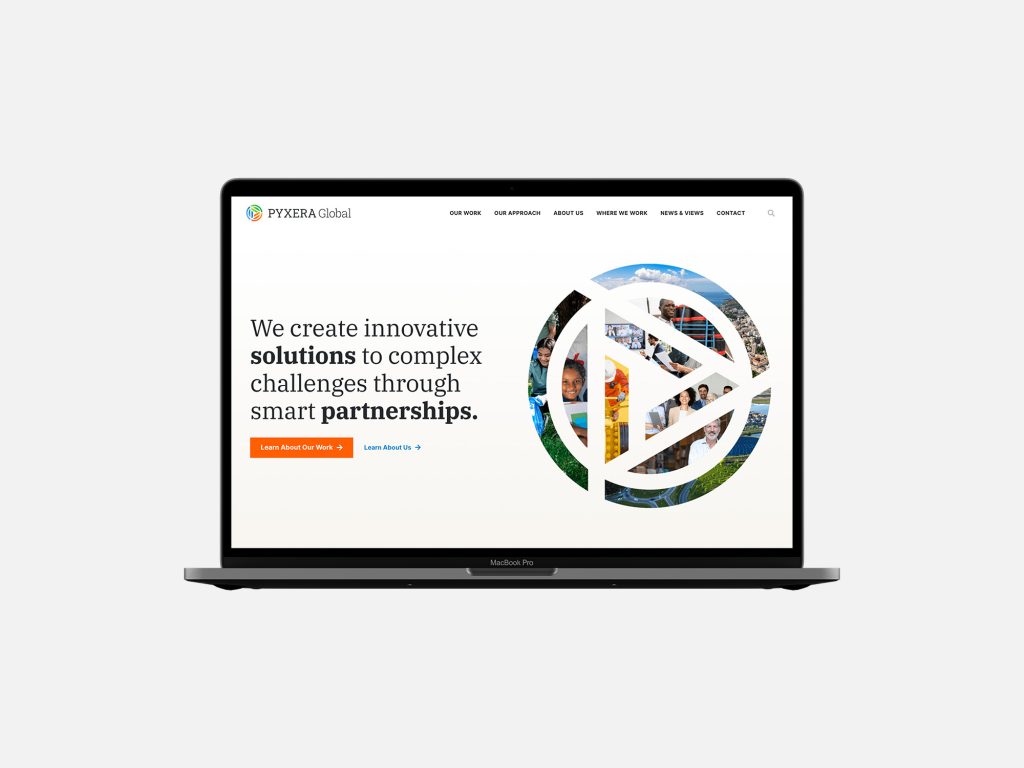
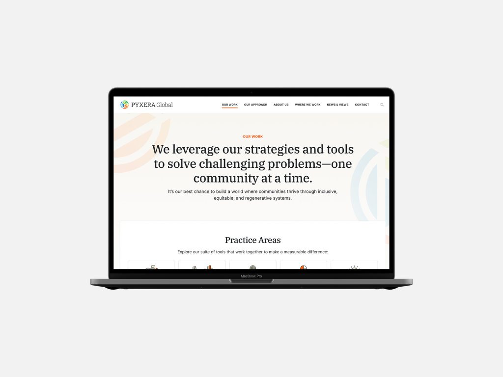
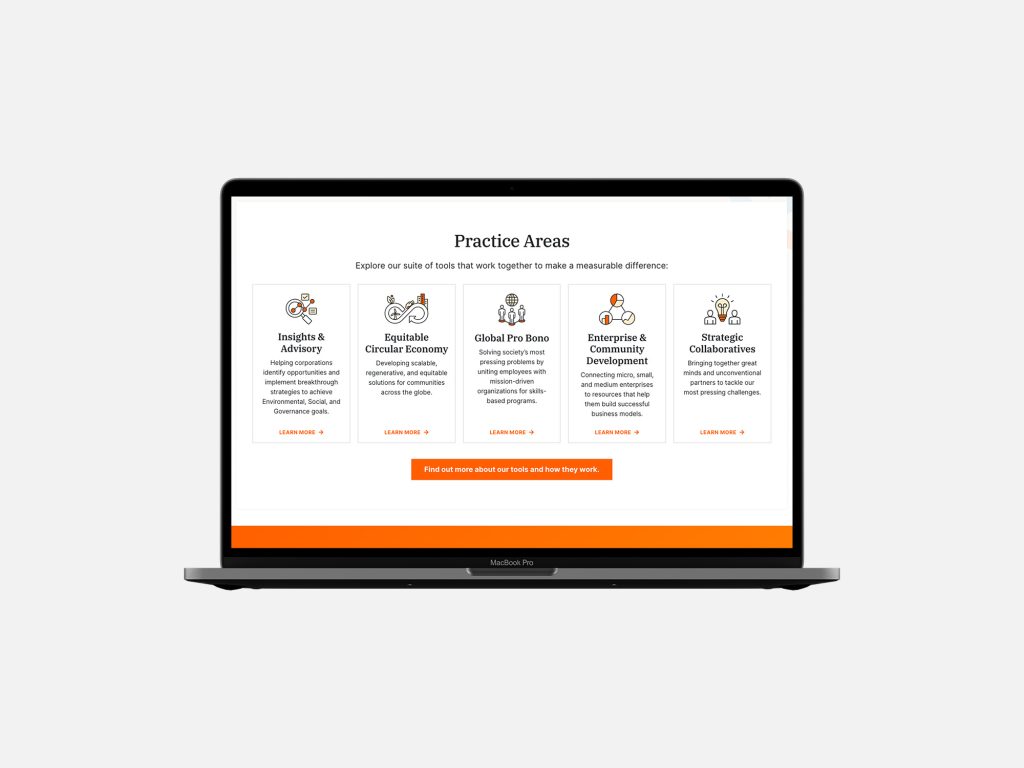
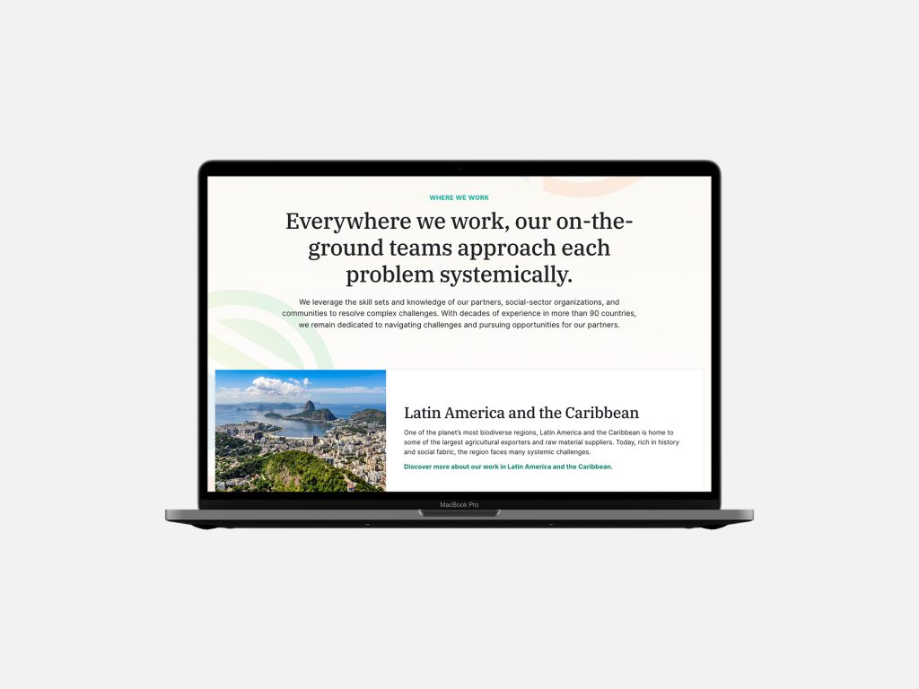
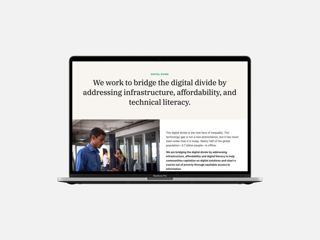
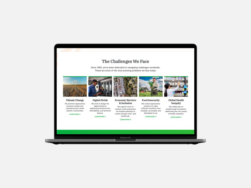
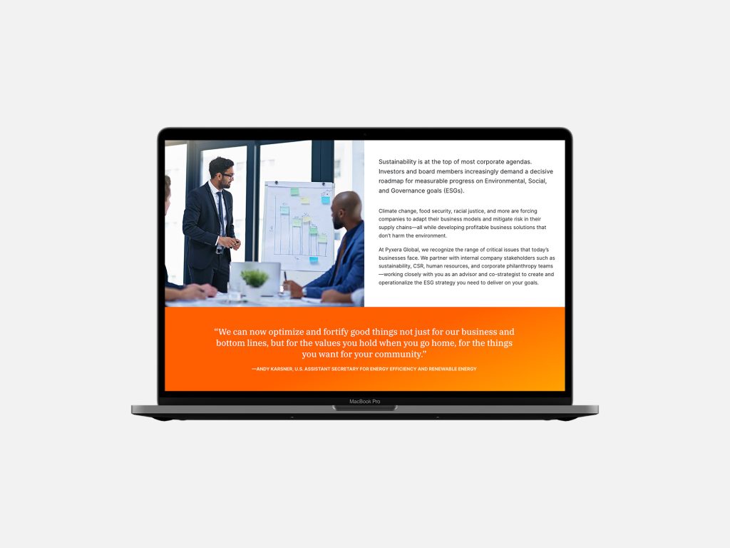
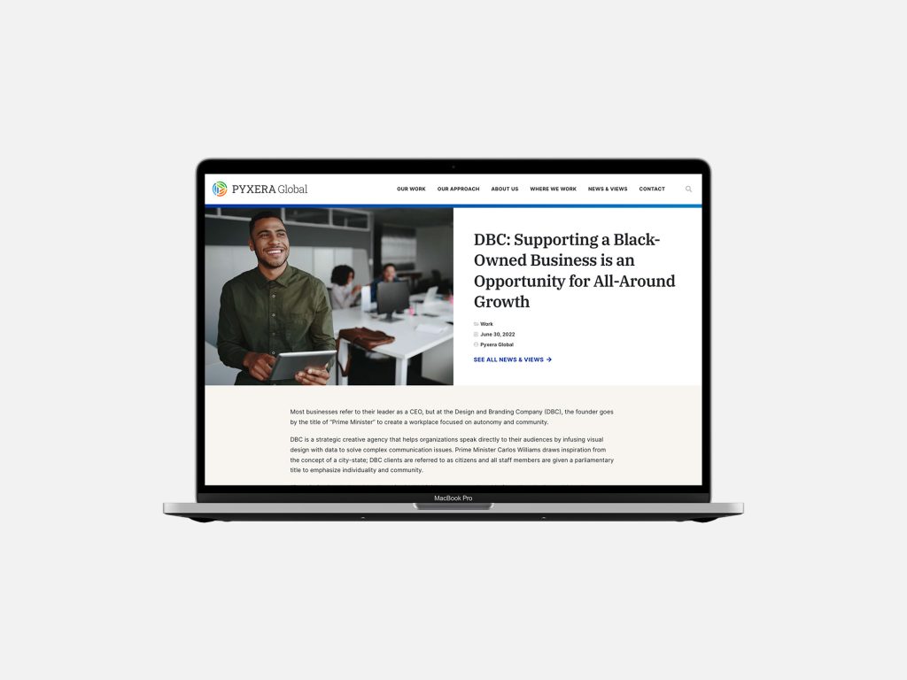
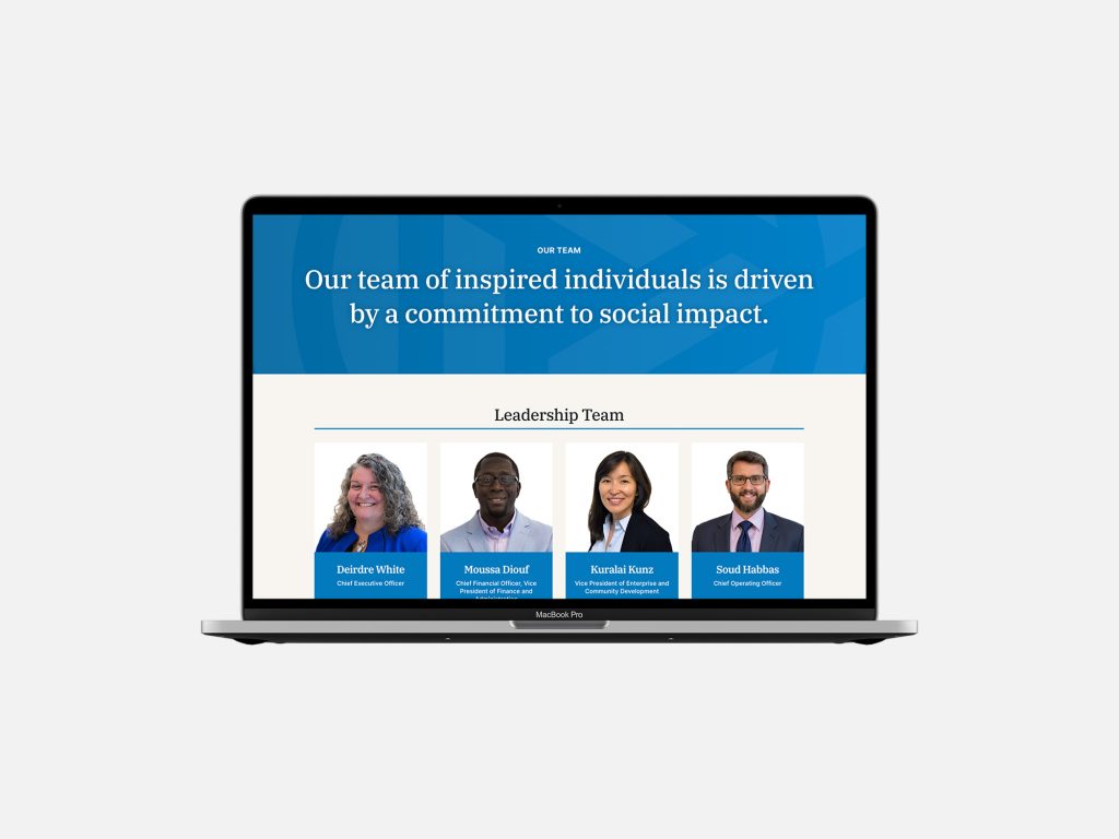
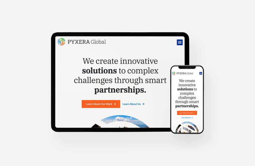
A selection of screen shots from the Phase 1 Launch Site.
The observation phase was helpful for both teams as the new website was put to work. While the Pyxera Global comms team was able to advance a lot of new content, they couldn’t get sign-off from various departments to publish many pieces. While we’d love to have seen more site use during Observation, we still learned a good deal heading into Phase 2.
We made the most of Phase 2, refining CPTs, content, and some layout and design simplifications to make content production easier for the team. The comms team also advanced their rebrand, so we could update the website styles and introduce an additional CPT for employee features.
Overall, the site is off to a great start, and we’re looking forward to seeing where Pyxera Global takes it next.
This project was produced at HALO 22. See the original post.
Art Direction: David Spratte, HALO 22
Design: Emily Combs, HALO 22
Project Management & Development: Jennifer Bedell, HALO 22