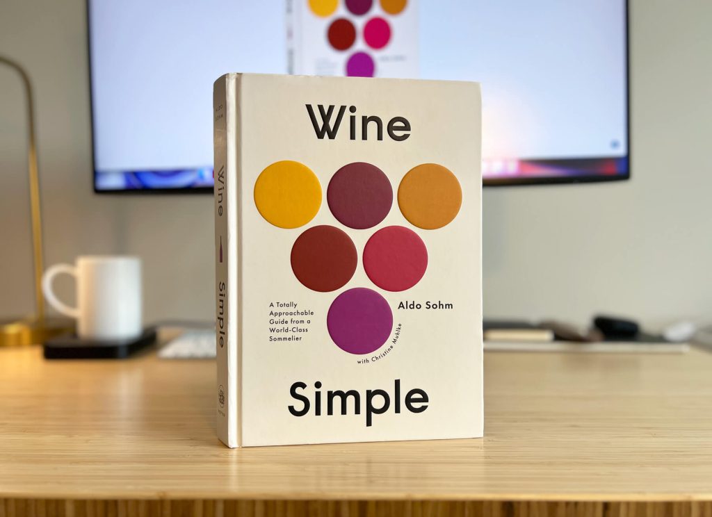
Wine Simple: A Totally Approachable Guide from a World-Class Sommelier
Written by: Aldo Sohm, Christine Muhlke
Illustrated by: Matt Blease
Designed by: Alaina Sullivan
Textbook Design Style
Before purchasing a hard copy of Wine Simple, I’d seen screenshots of a few page layouts. I’m a sucker for grids, clean design, and wine. What’s not to love about that combination? It became clear that I needed to explore further. I’m so happy I did.
One thing I love most about Wine Simple is that the content and purpose inform the design of the book. Creating a “totally approachable guide” to anything requires careful consideration of content hierarchy: The subject matter must be written and displayed in digestible and memorable ways. If the point is to learn quickly, the layout must serve that function.
Repeatable Elements
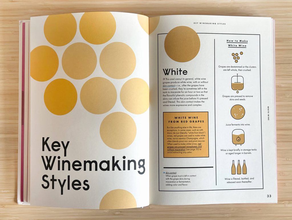
Textbooks rely on repeatable design systems. It’s practical for layout but also helps reinforce the learning process. While the minor details of a spread layout may shift a little to accommodate text length or line breaks, the reader can expect to turn the page and find a matching theme in each section. It helps group like pieces of content together for easy skimming, which is helpful when reviewing what you’ve just read. Wine Simple does a tasteful job of using crisply designed section templates with touches of unique illustrations, icons, and breakout boxes to maintain the reader’s interest.
Illustrations
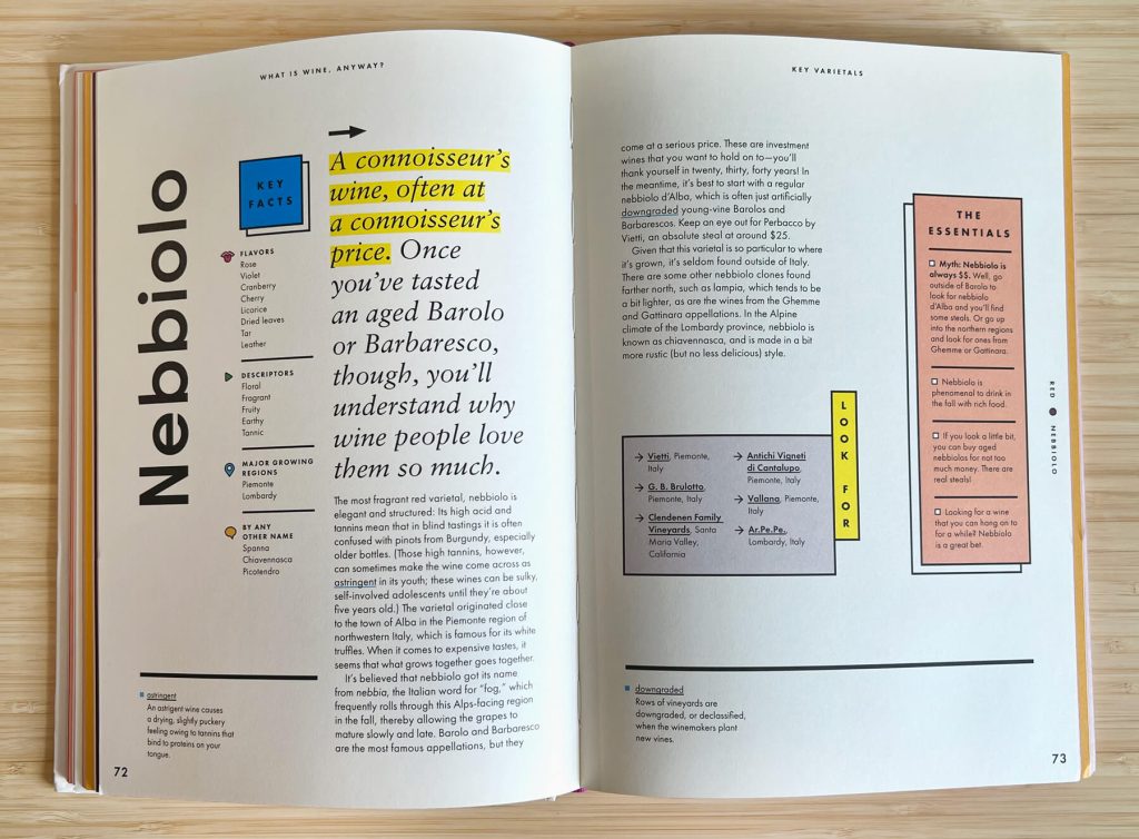
Speaking of art, Matt Blease’s illustrations do a great job of supplementing the written content. I’m not sure if the illustrations came first and the layout after or if it was a coordinated effort, but it’s a great pairing. The line quality of the art complements the book’s simplified design style and brings a reprieve of softness to a very structured layout. Chef’s kiss!
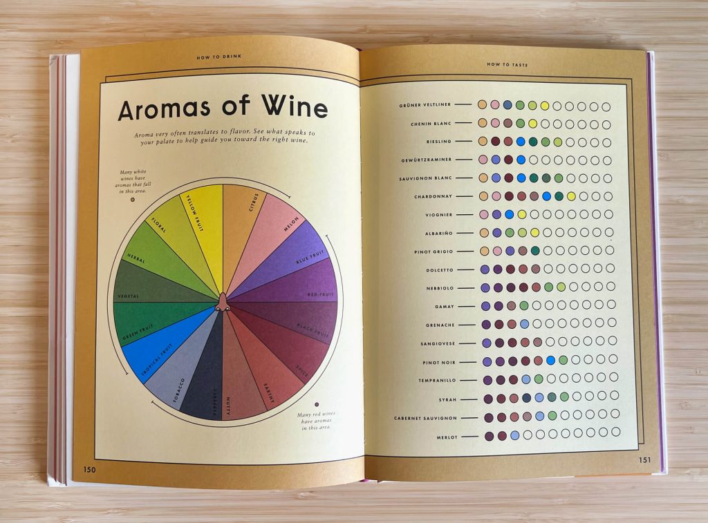
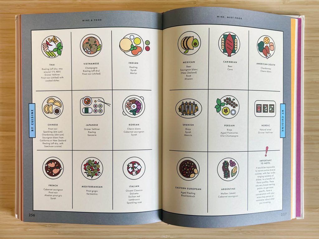
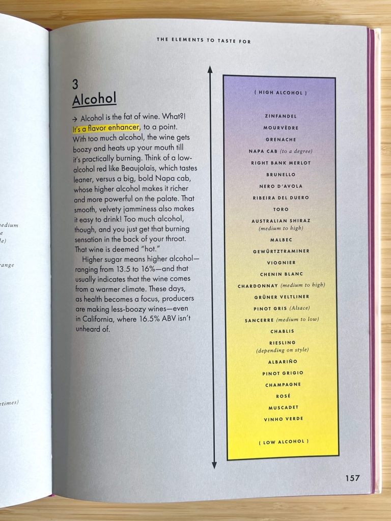
Illustrated charts allow the reader to pause between text-heavy sections.
Color and Fonts
The color palette is as sophisticated as the book itself. They’ve chosen colors that represent different varietals of wine and deploy them with a limited selection of secondaries to emphasize or soften. The sections aren’t color-coded, but there’s definitely attention to detail on how color is deployed. For example, I loved the way they’ve chosen to highlight specific text. On light backgrounds, it’s highlighted in bright yellow. Otherwise, the highlight is reversed in white on a color background. If you’re learning how to pay attention to detail in wine, you may also pick up on great ways to do the same with design in the process.
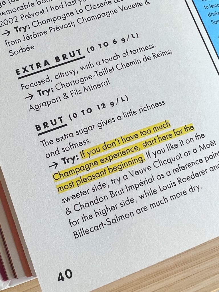
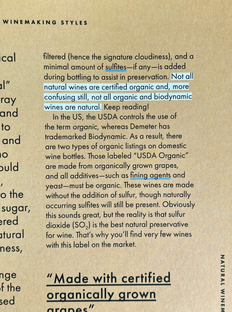
Highlights change color based on the background.
Typographic styles are also handled elegantly. As far as I can tell upon first read, there are three fonts: A Futura-ish flavored quirky title font, probably Futura or some flavor of it for reading copy, and a serif (I’m guessing Garamond) only set in italics for introductions or notes. It’s a combination that allows for a modern, sophisticated look with a touch of quirkiness.
—
If you can’t tell by now, I’m having a great time savoring this book on my first read-through. It’s the kind of informative eye candy that sticks with you for the long haul, and I applaud everyone involved in its production!
Written by: Emily Combs, HALO 22
Edited by: David Spratte, HALO 22