Back again with another cover suite for boundary 2—ranging from bold and bright to reflective and muted.
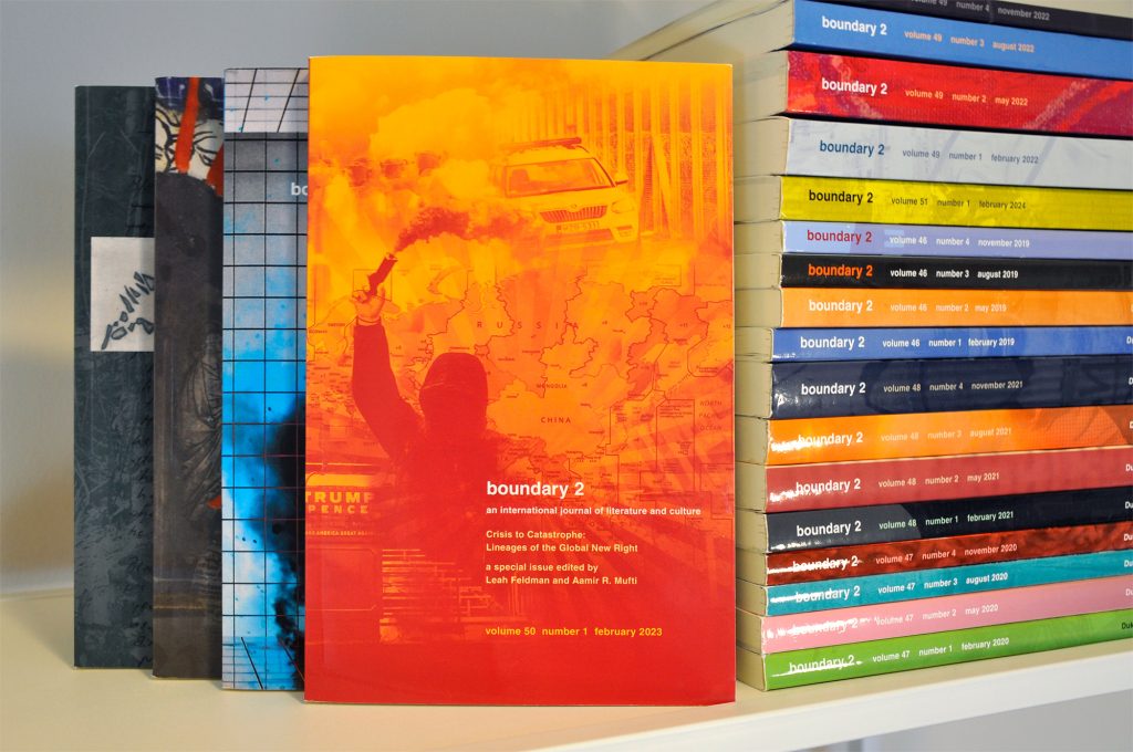
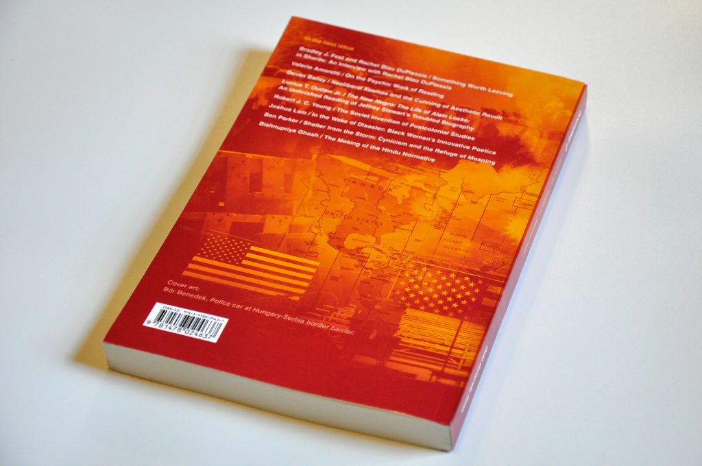
50:1 kicked off the volume with a punch by examining the evolution and damages of the global far-right movement. The blended images highlight violent and political topics covered in the issue contents, and the vibrant red and yellow color scheme leans into the sense of warning and danger the images and essays convey.
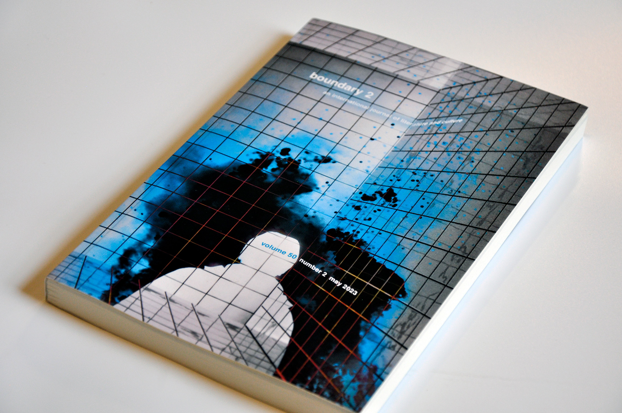
Whereas 50:1 targeted a specific topic, 50:2 was a bit of a generalist, featuring many review essays. We agreed with the editors that a more tonal approach would allow readers to develop their own meaning for the cover. The photography choices touched on a few of the essay concepts, and we brought order to the chaos by applying a literal grid behind it all. Cool color tones helped unify everything—and differentiate from 50:1.
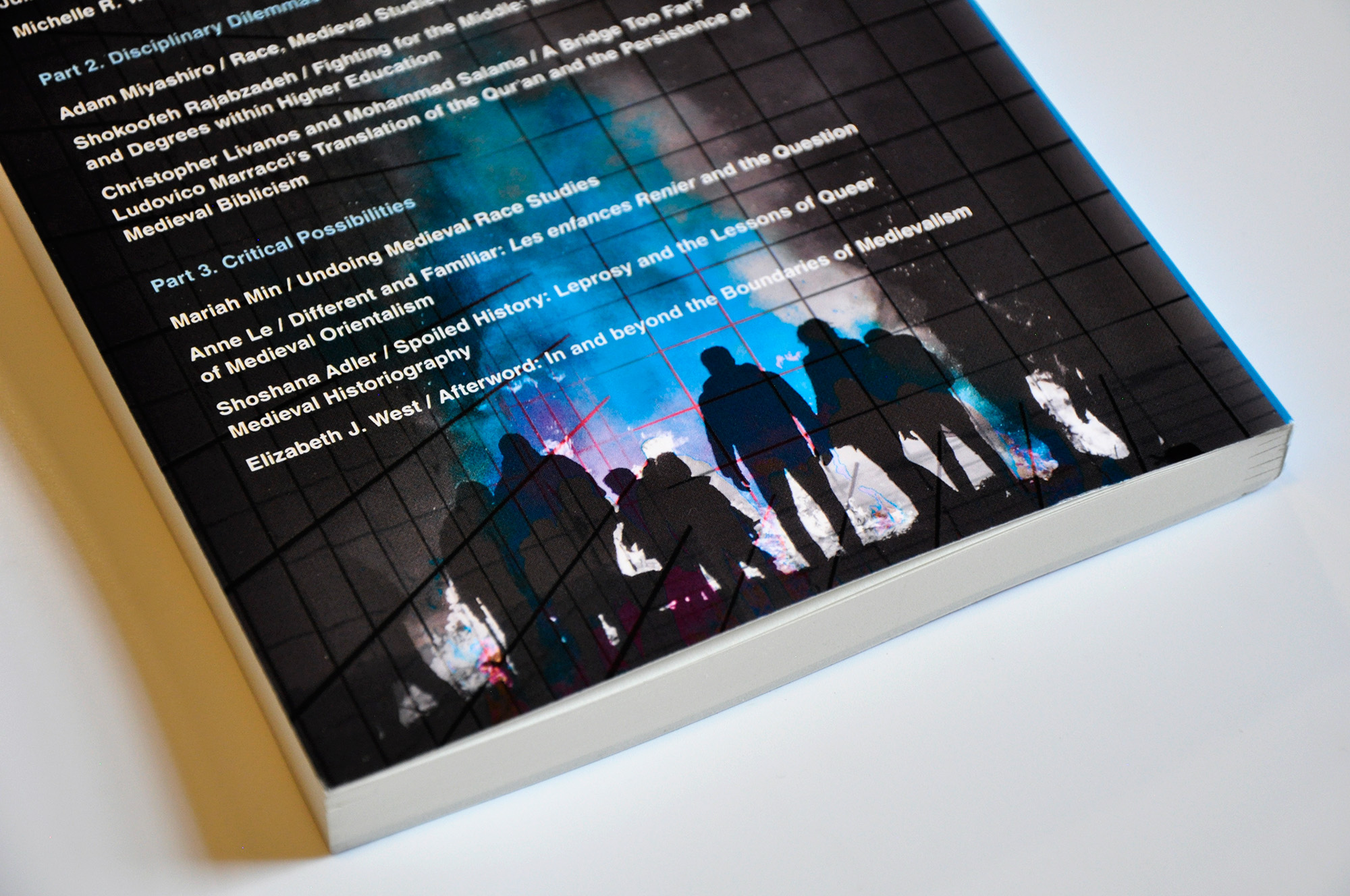
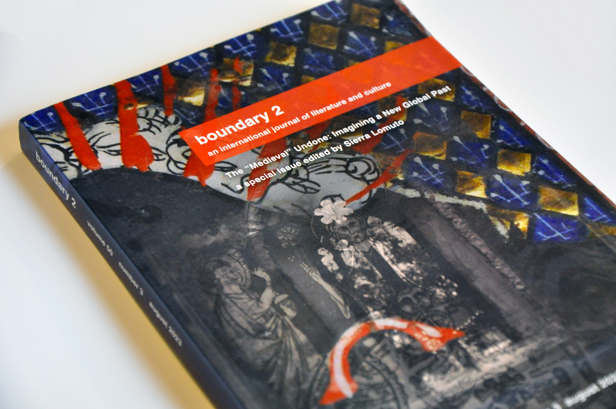
Special issues like 50:3 bring in a guest editor to hone a particular subject matter. In this case, the focal subject (roughly) was the far-right politics of Medievalism and its relationship to the ideology of white supremacy. The guest editor directed us toward imagery that would fit the time and the topics, and we worked closely with her and other b2 editors to ensure this cover didn’t unintentionally beautify those ideologies. The result is layered and dark—much like the issue itself.
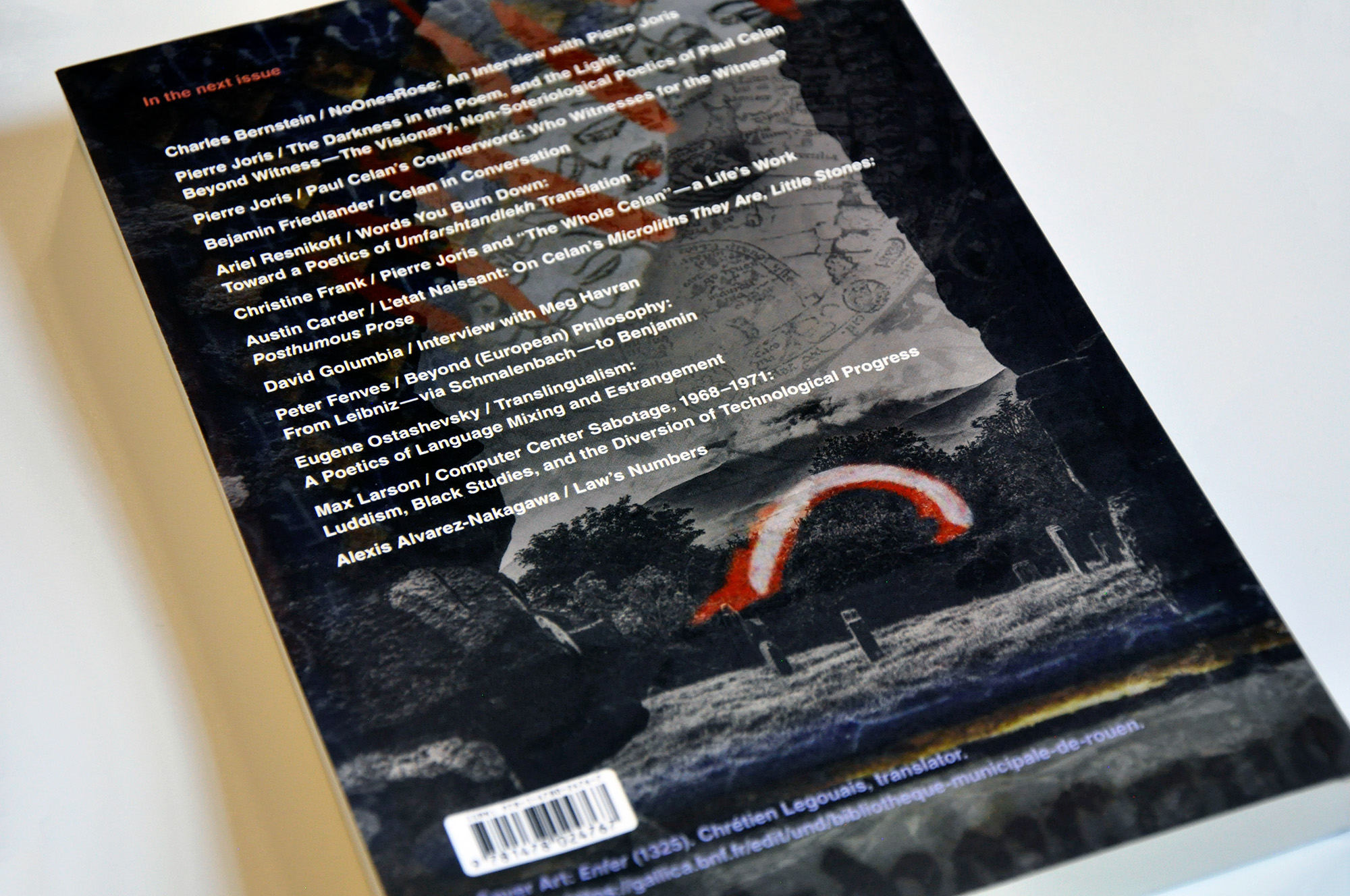
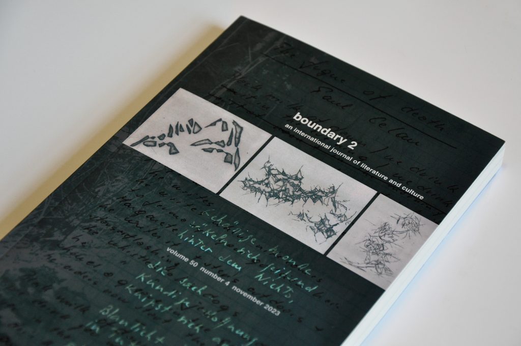
The volume closes with a spotlight on Paul Celan, a poet and translator of the post-WWII era. The editors were in touch with a family friend who provided photography of Celan, scanned images of a manuscript by Celan’s son, and a few etchings by Celan’s late wife—relevant because French surrealists deeply influenced Celan.
If you’ve ever met us, you’ll know that we love a design challenge. boundary 2 keeps us on our toes and leaves us with thoughtful, bold artwork.
This project was produced at HALO 22. See the original post.
Art Direction: David Spratte, HALO 22
Design & Photography: Emily Combs, HALO 22