We’re already rolling on the next conference, but we wanted to wrap up the last component of our work for NCSC’s CTC 2023 conference: The on-site materials.
We refreshed the CTC brand and rebuilt the website, and then it was time to close the experience loop by producing top-notch materials that stayed on brand and helped attendees make the most of their time in Phoenix.
Doing this right means getting feet on the ground on a site visit to get the lay of the land—and conference center.
The next thing is the size of these spaces: They are enormous. It’s easy to get caught up in that part of it, but you have to picture them occupied by several hundred people.
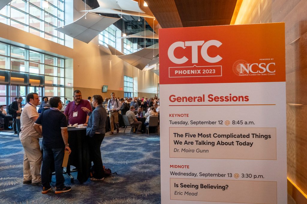
That makes a difference. The small sign on an easel disappears behind a crowd, but something taller can serve as a landmark.
Being aware of the schedule helps visualize and plan for traffic flows. Where do attendees need to go? What do the hosts want people to be aware of?
Doing all of this and making sure that the finished products reinforce the months of other brand work are the keys to completing the experience.
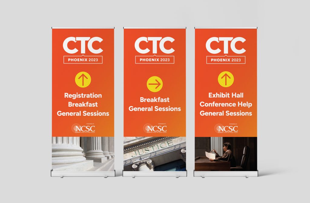
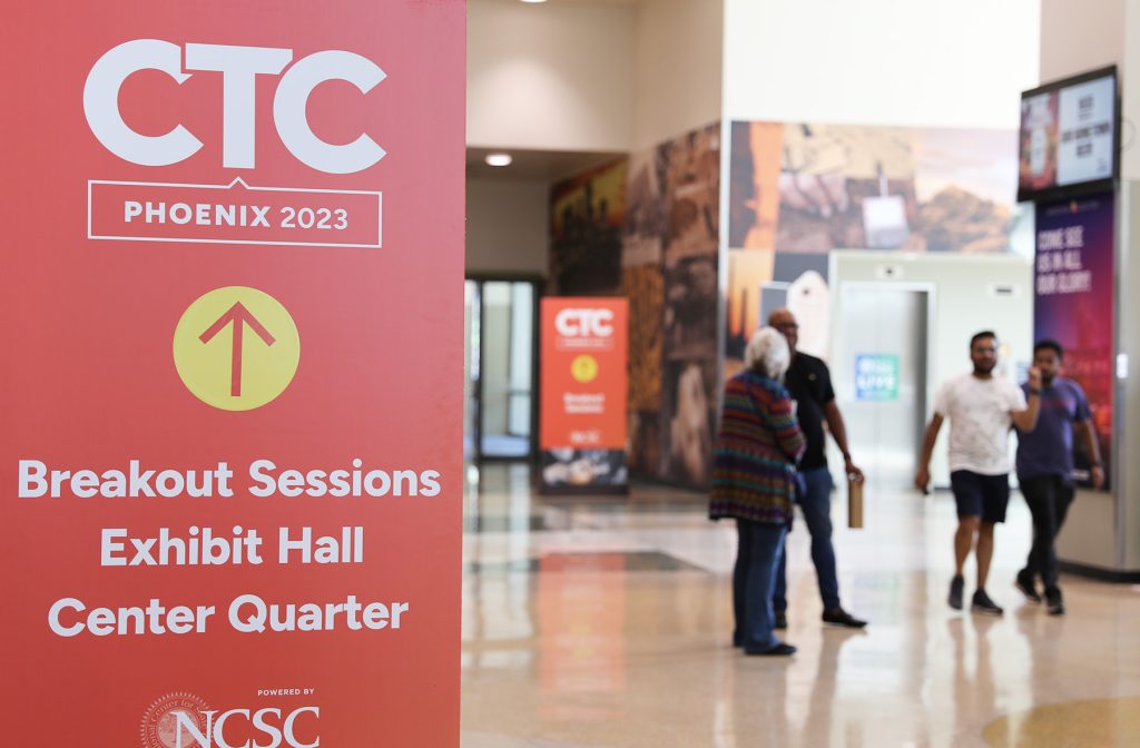
Below: Large format directional pieces.
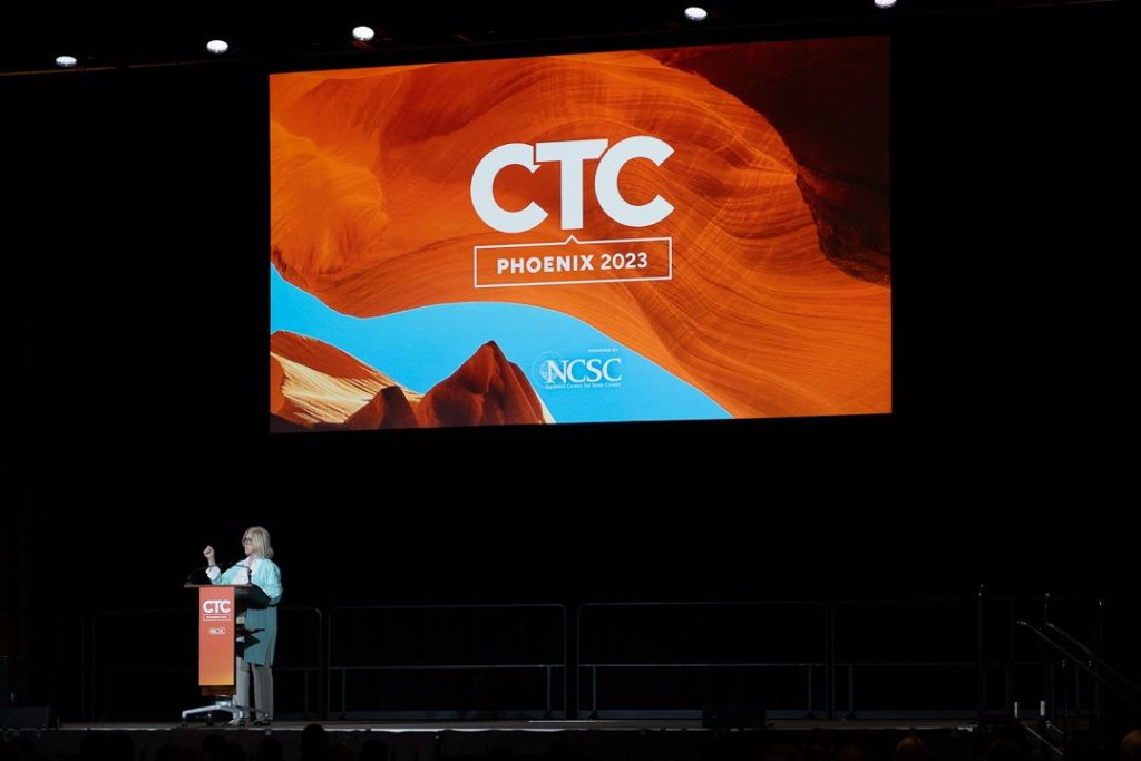
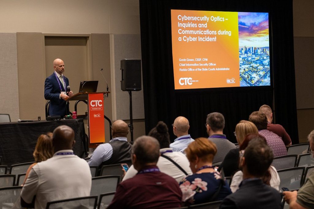
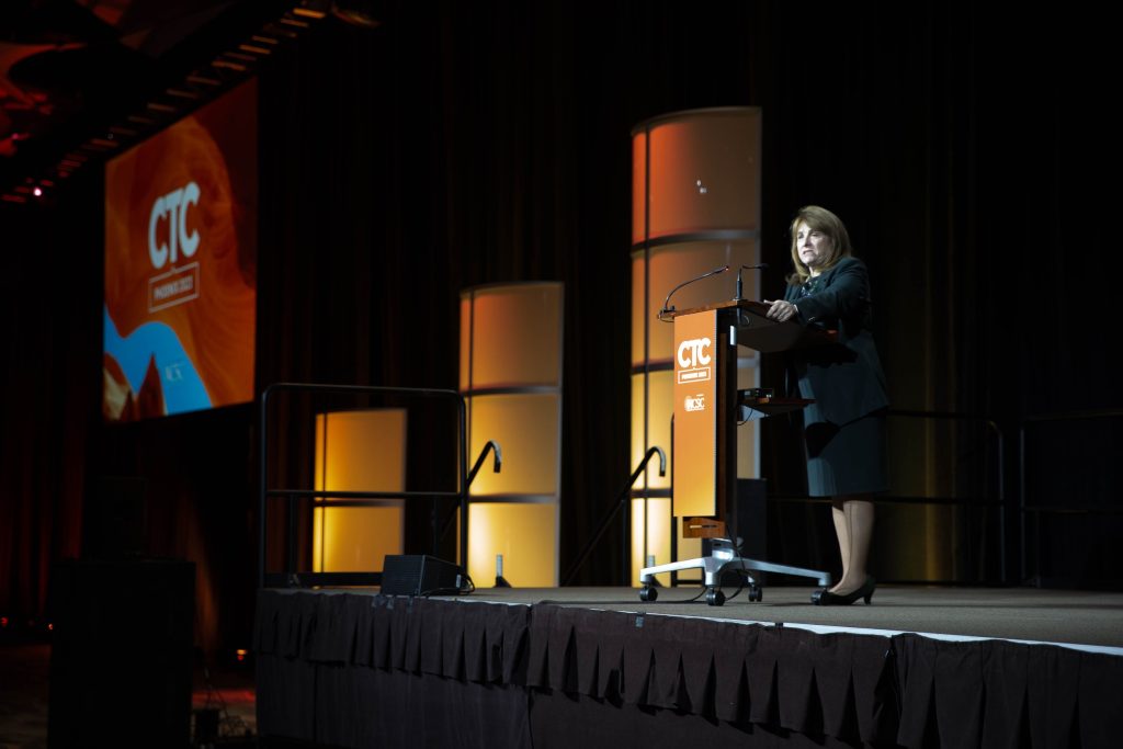
Below: Podium signage and presentation graphics.
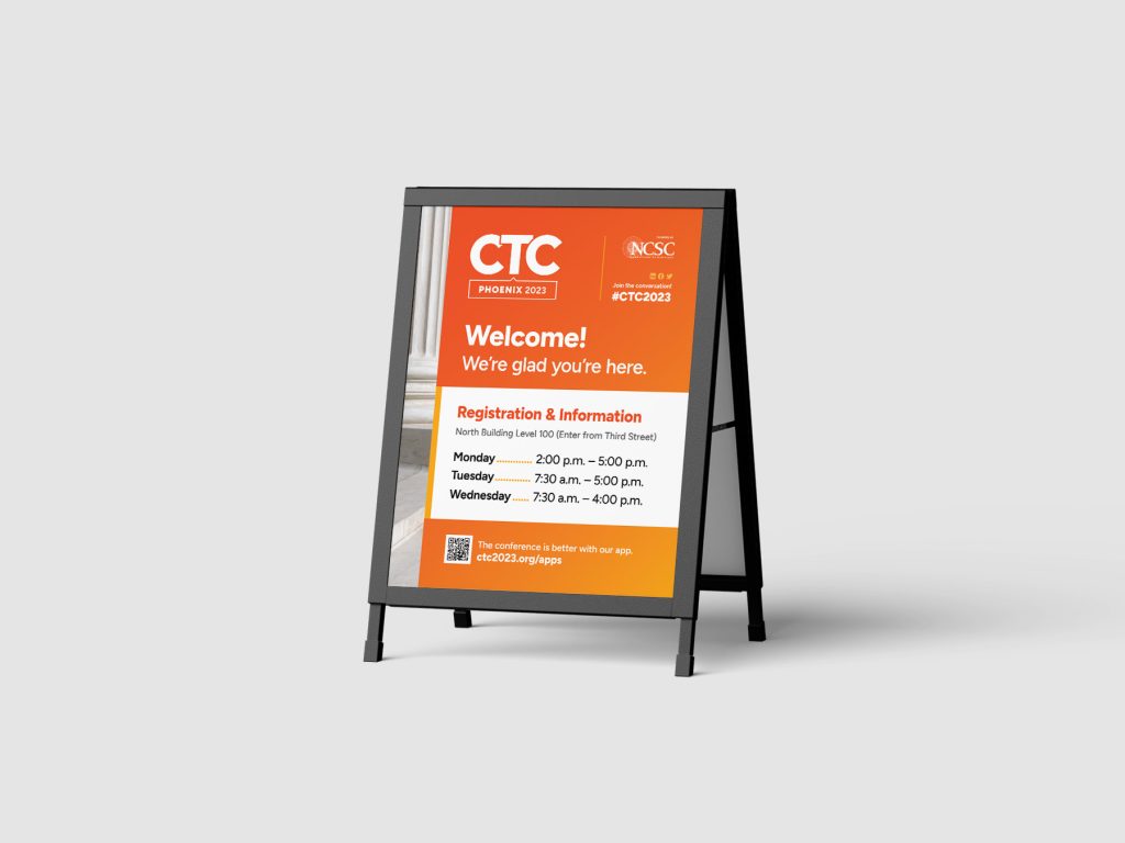
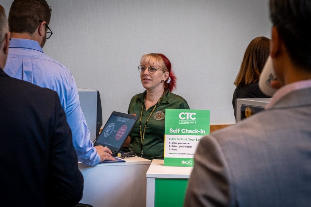
Below: There are areas that require smaller pieces, like a hotel welcome sign or the self check-in counter at the conference.
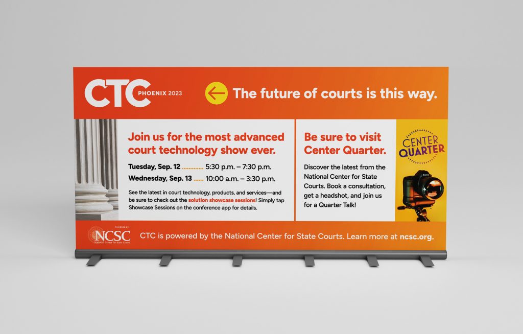
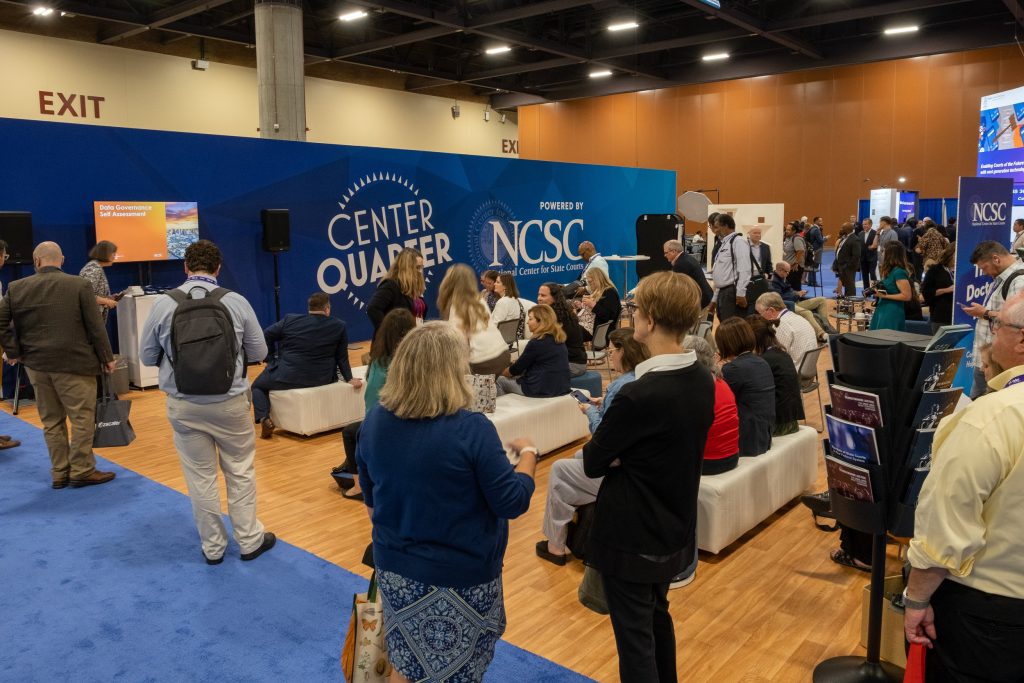
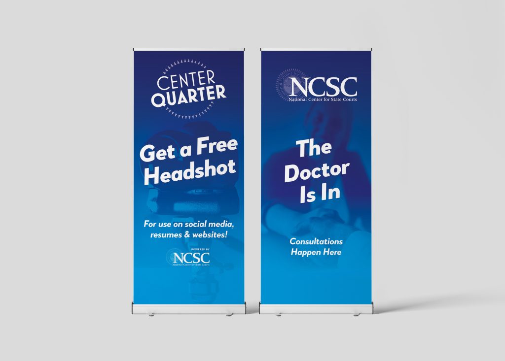
Below: We also designed the backdrop and meter board graphics for NCSC’s Center Quarter—a spot to rest, catch a presentation, meet the team for consultation, or even get a professional headshot taken.
This project was produced at HALO 22. See the original post.
Art Direction: David Spratte, HALO 22
Design: Emily Combs, HALO 22