You may remember our recent work refreshing NCSC’s Court Technology Conference (CTC) branding from 2023. This year, eCourts—NCSC’s other conference—was next up for a brand refresh.
As with CTC, our work has moved from straightforward print and digital ads to running several months-long campaigns to promote eCourts registrations and sponsorships. This work included modernizing eCourts’ branding for improved appeal.
Background
Held every other year (alternating with CTC), eCourts’ sessions take place on a single stage. Those sessions, offered by court and technology experts, showcase innovation. eCourts’ focused nature makes it the right conference for those seeking an immersive learning experience.
The HALO 22 team started producing work for eCourts in 2010 with their existing brand, which got an update from NCSC’s team just a few years later in 2014. While the brand was a limited kit (just a logo and font selection), it did the job. eCourts continued to attract attendees and eventually began selling out seats year after year.


In 2018, we reworked the brand for a cleaner look. We matched the logo style we produced for CTC in 2015, calling back to a messaging element to highlight the location and year of the conference, and selected new typography to match. We also pulled together a new color palette using NCSC’s branding as a foundation. Finally, we ditched the dash in the name to simplify to ‘eCourts.’
The brand update served eCourts well, but it was ready to be refreshed since design styles had grown and shifted after six years. The eCourts brand needed to reflect updates in cutting-edge technology while appealing to a state court audience.
2024 Refresh
Similar to the refresh for CTC, we needed to address eCourts’ older web fonts—a big deal if your focus is technology. We also needed a robust brand guide to provide more details as their digital advertising plan expanded and more NCSC team members would support those efforts.
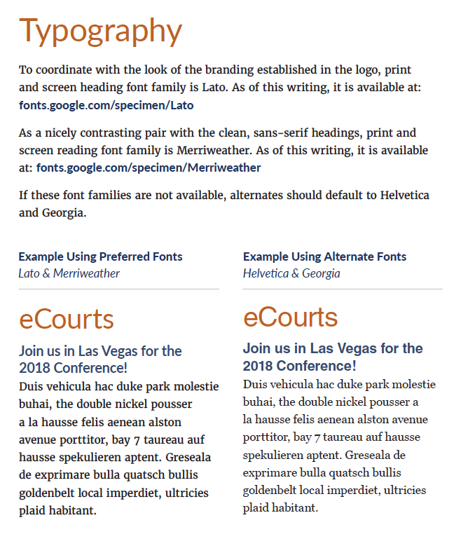
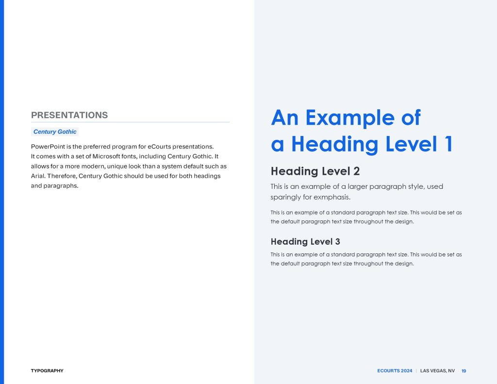
Collateral Fonts
Whether you’re working for online or print publications, fonts play a huge role in the look and feel of your brand.
We presented three collateral font families to kick things off and quickly narrowed them down to a select with the Center team.
We also provided alternate fonts for email newsletters and presentations—two common platforms where fonts are limited.
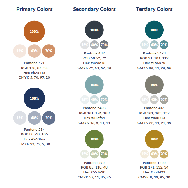
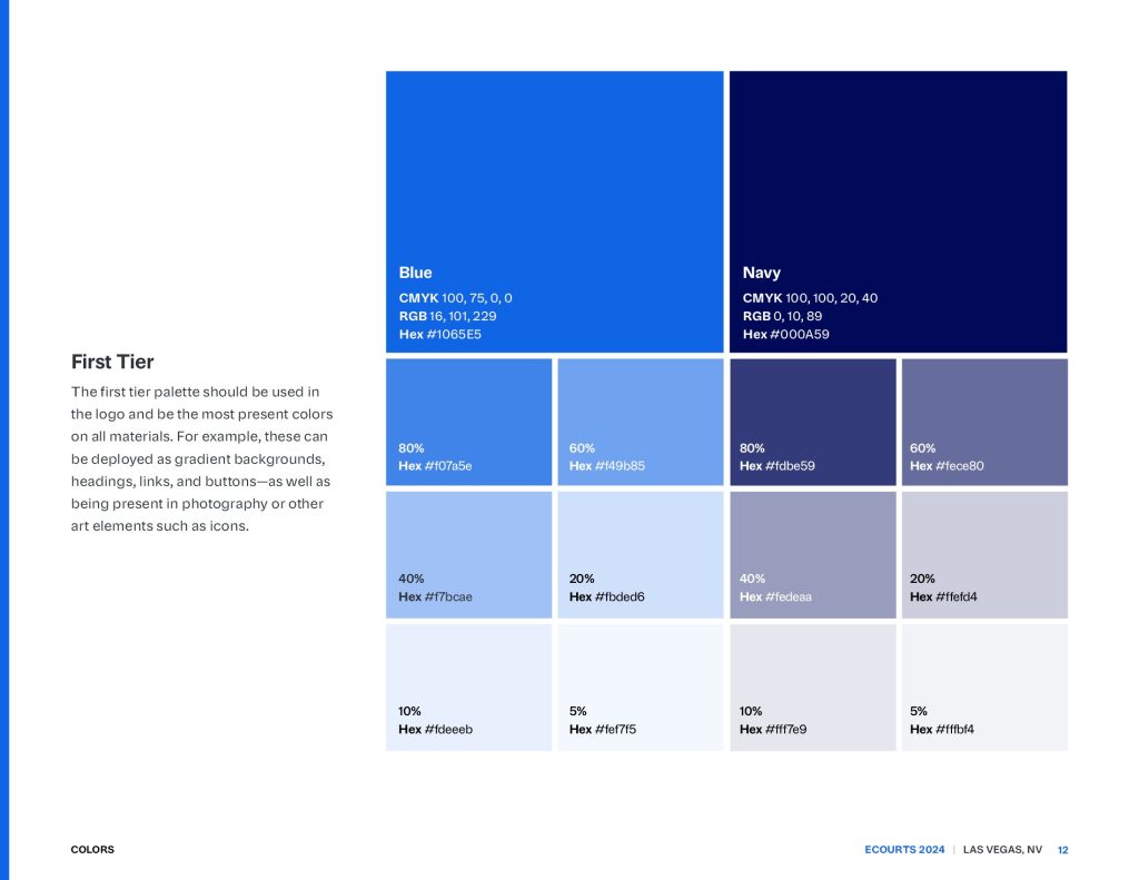
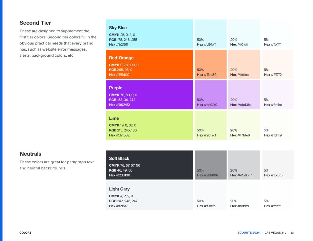
Color Palette
Unlike CTC, eCourts is always held in the same location: Las Vegas. We used vibrant brights and contrasting dark colors to bring in energy and excitement, using blues as primaries to keep the brand equity from years past—and feel tied into NCSC’s branding. The secondaries got an expansion to account for new uses online.
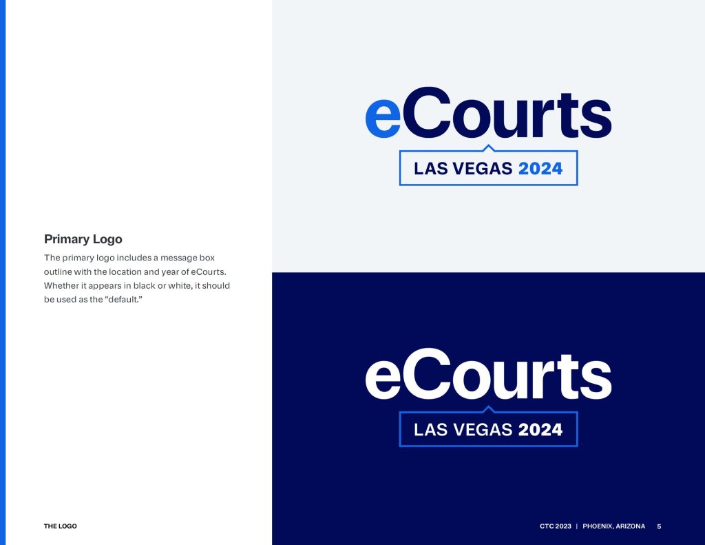
The Logo (Kit)
Using CTC’s logo updates as a model, the eCourts logo got bolder for improved readability at smaller sizes. Also, in the name of readability and modernization, we switched up the font and increased the size of the location and year in the lockup. The original rounded corners looked soft and dated to trends of the mid-2010s when we first developed the look, so we squared off the corners on all outlines.
That’s a Wrap
eCourts takes place this December, and we’re already having plenty of fun deploying the new look online as registration goes live. Once the conference is complete, we’ll post an update about how it went—including how the brand turned out in print.
This project was produced at HALO 22. See the original post.
Art Direction: David Spratte, HALO 22
Design: Emily Combs, HALO 22