A well-crafted identity takes time. But sometimes, life (and business) works a little out of order—and that’s where a quick ship identity comes in.
Some of our friends in Raleigh are working hard to build a temporary skatepark to activate underused land in a core part of the city. The land could eventually be home to Devereaux Park, but in the meantime Skate Raleigh could serve as a spot for local skaters while the city works through the Deveraux master plan. Our friends are in the early advocacy stages for this and other initiatives, and needed a logo completed within 72 hours because of some early press exposure they were about to get. If the project gains enough traction, the identity may eventually be used on fundraiser merch as well.
Building a Foundation with Type
We started by quickly testing sets of very bold, chunky sans-serif typography—inspired by skate brands such as Vans, Volcom, DC Shoes, and more. We saw no need to reinvent the wheel in terms of type, especially since our plan was to make it look as though the letters had been skated through. The type needed to be able to withstand that treatment and maintain legibility. It was a great way for us to make a very unique identity without the time or budget to develop imagery or more custom tailored lettering. Plus the skate-through effect is relevant for skaters, boarders, and bikers.

Fully Committing to Creative Color
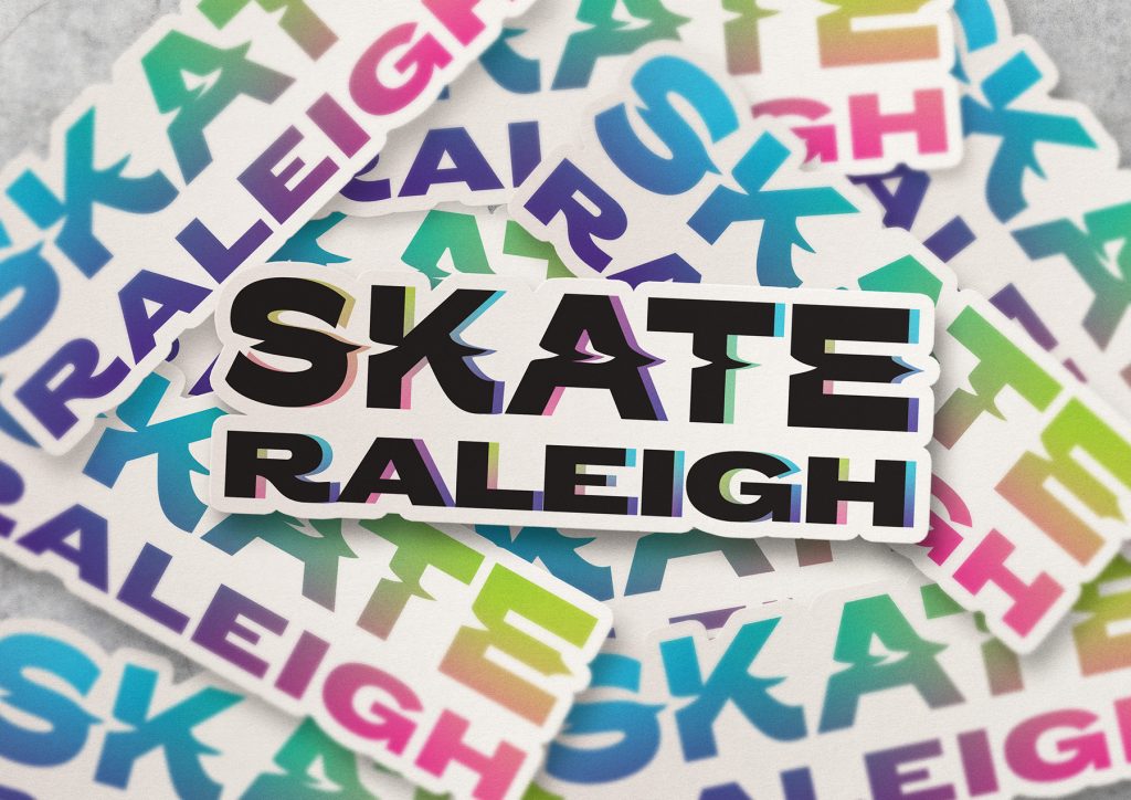
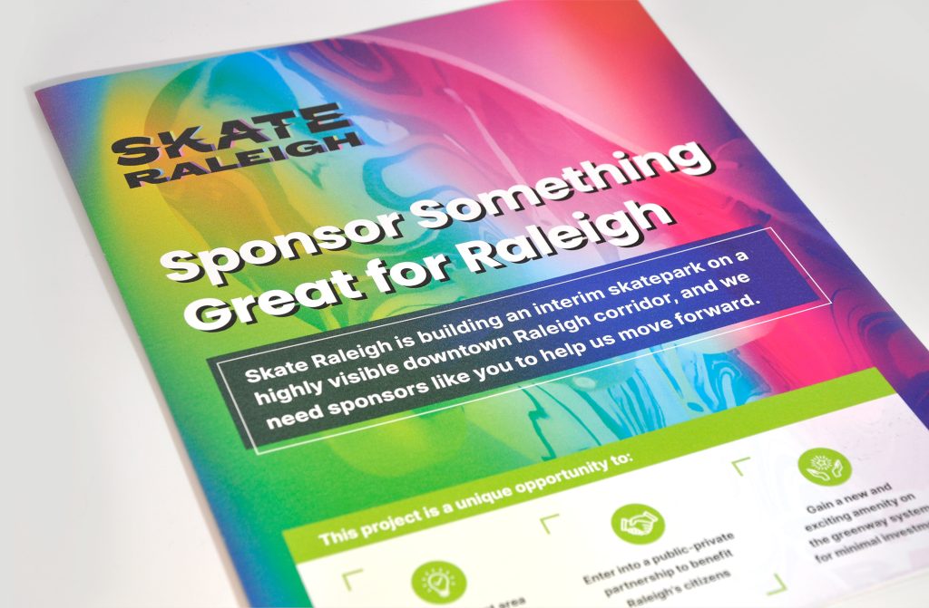
Raleigh teens and a younger community of skaters are already the champions of this project. So, the logo definitely needed to appeal to a vibrant, energetic, youthful crowd. We chose a neon gradient effect that can be presented with flat or 3D lettering and we have a lot of room for artful experimentation on future projects.


Fundraising with Skate Raleigh
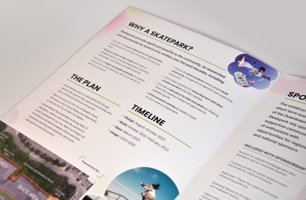
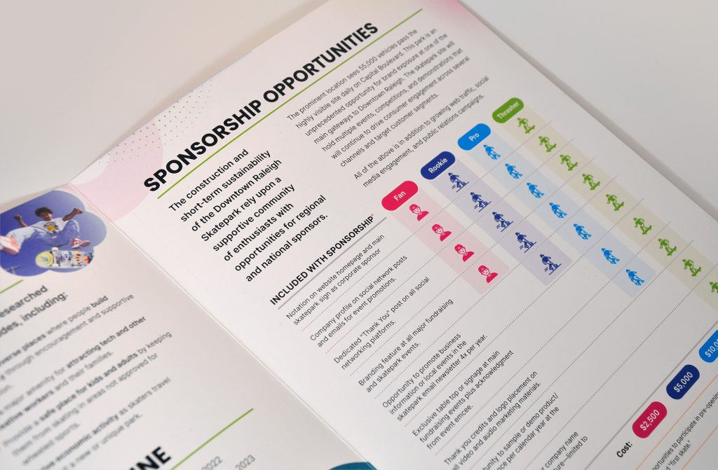
In addition to getting the brand in place and the website up and running, Skate Raleigh’s first task was to get a jump on raising funds needed to build that skatepark in downtown Raleigh.
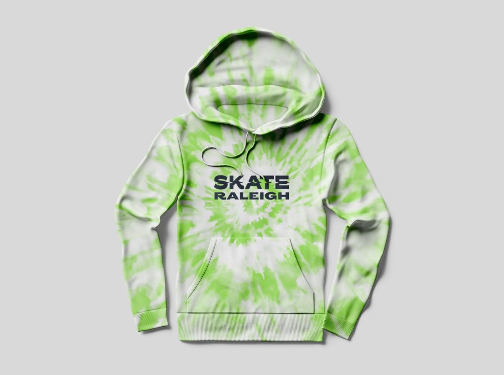
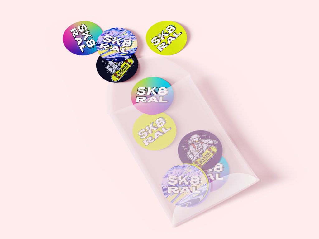
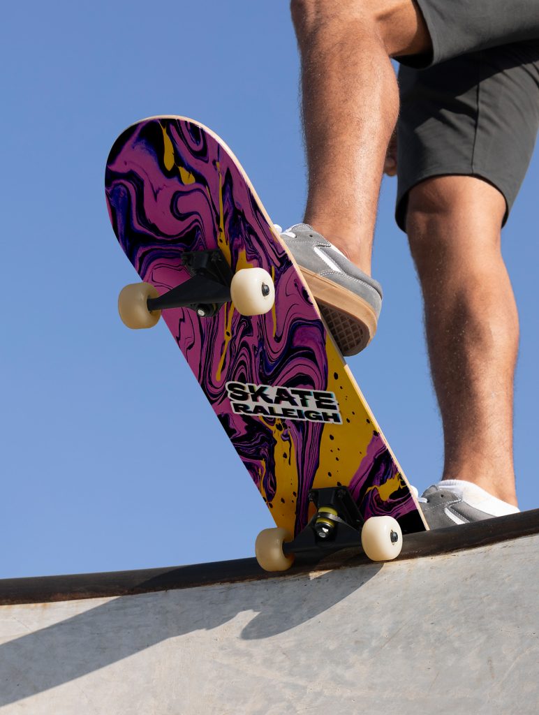
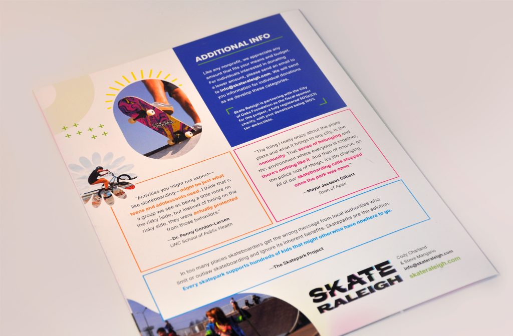
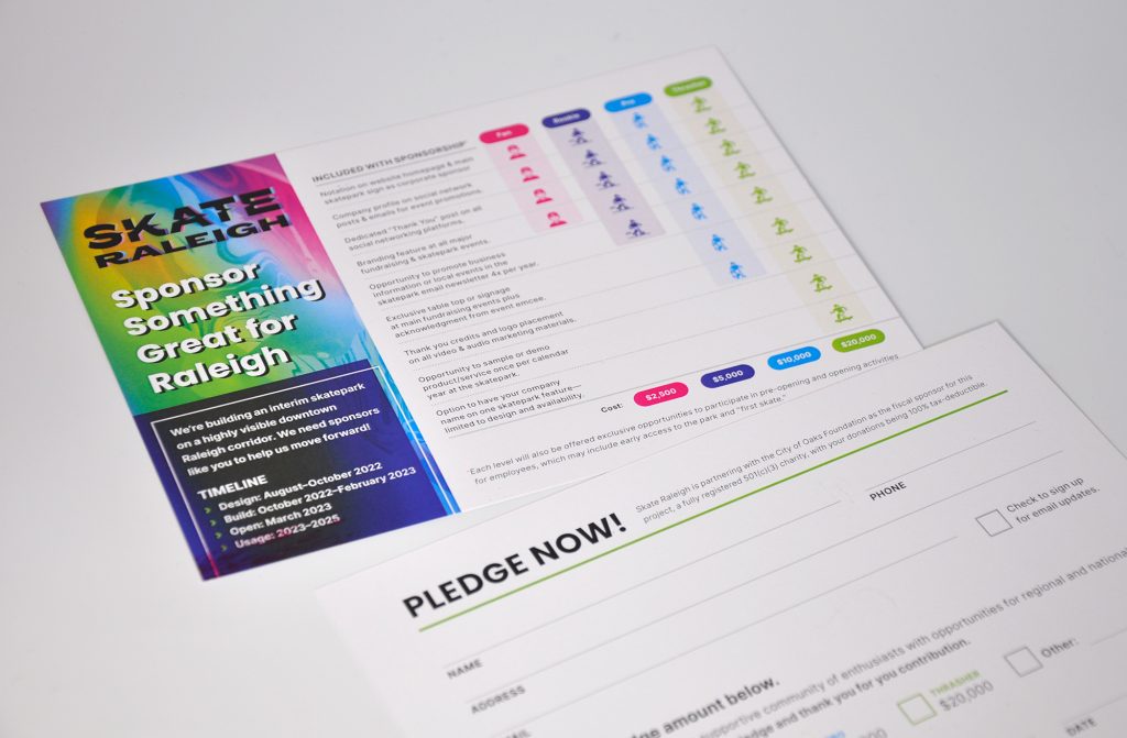
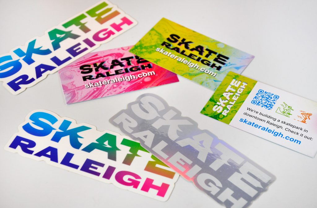
While Skate Raleigh’s board organized the kickoff fundraiser, the whole team got to work building out a sponsorship kit, pledge cards, takeaway cards, and, of course, stickers. (Because who doesn’t love a sticker?)
It’s always satisfying to design a brand that’s met with such enthusiasm—jumping right into print with a brand is extra satisfying.
On top of that, the event was a huge success.
What’s Next for Skate Raleigh
We hope to see the project take off in the near future. You can sign up for notifications about it on SkateRaleigh.com, or learn more about the project from Raleigh Magazine.
This project was produced at HALO 22. See the original post.
Art Direction: David Spratte, HALO 22
Design & Print Production: Emily Combs, HALO 22