When the NC House and Senate passed a bill in September 2021 allowing social districts in the state, cities across North Carolina got to work setting theirs up. Downtown Durham’s plans were already in progress when they approached us to name, brand, and create materials for the social district.
Not familiar with the concept of social districts? Downtown Durham’s FAQs have you covered:
A social district is a defined outdoor area in which a person may consume alcoholic beverages sold by an ABC permittee. This area is separate from areas already permitted for outdoor dining. In practical terms, this means a customer could purchase a drink from one merchant and consume it outdoors or in a public space, retail outlet, or other venue located within the social district.
Naming is Everything for a New Brand
Since social districts are a very new idea to our state, there was plenty of debate about what to call Downtown Durham’s. Of course, everyone wants something short and catchy—but would that be enough to make things clear to downtown patrons? We also had to make sure that whatever it was named, it was iconic to Durham and unique to the downtown landscape.
That led us to a combo approach: The district should have a short, catchy name that’s useful in casual conversation, but we also wanted to build in a way to include more information when needed. We landed on The Bullpen: Downtown Durham Social District.
For those not native to Durham, its nickname is “The Bull City.” This goes all the way back to when tobacco was the core of the city’s economy. It’s also know as the City of Medicine, but the bull is essentially the mascot of the city—especially downtown. Downtown Durham is the home of the Durham Bulls baseball team, and is full of bull-themed signage, art, sculptures, and more. The Bullpen links that theme with the idea that the social district is a defined space.
Crafting a Logo with Lots of Detail
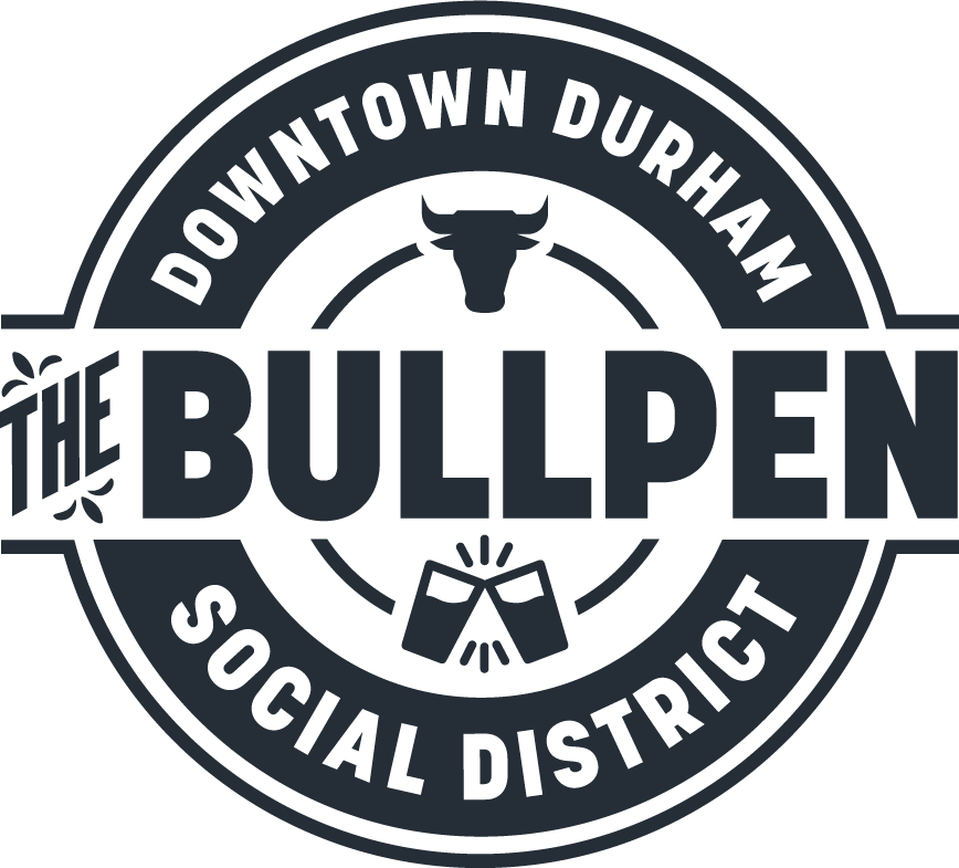
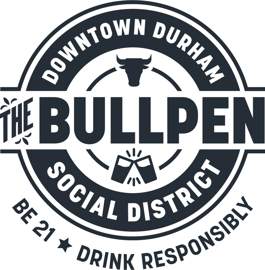
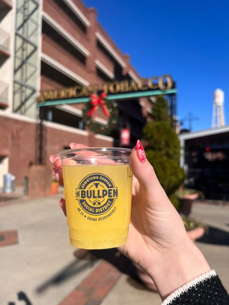
The Bullpen: Downtown Durham Social District is a bit of a mouthful as a full name. Plus, in some cases, the phrase “Be 21 | Drink Responsibly” would need to be included for legal reasons. Crafting a logo to hold the full name, a bit of imagery, and a tagline was a tall order, but the best approach quickly revealed itself to be a seal layout. The circular format of a seal is a perfect container for lots of wording that doesn’t take up too much space. It also meant we wouldn’t need a second or reworked layout when the tagline was required—it could be set in an arc and tucked underneath.
Working in Color
Figuring out the color palette was our next challenge. The obvious choice seemed to run with navy blue as a primary color since it’s associated with Durham Bulls and Duke. But that felt a bit too on the nose and it could have blended into the scenery a little too much.
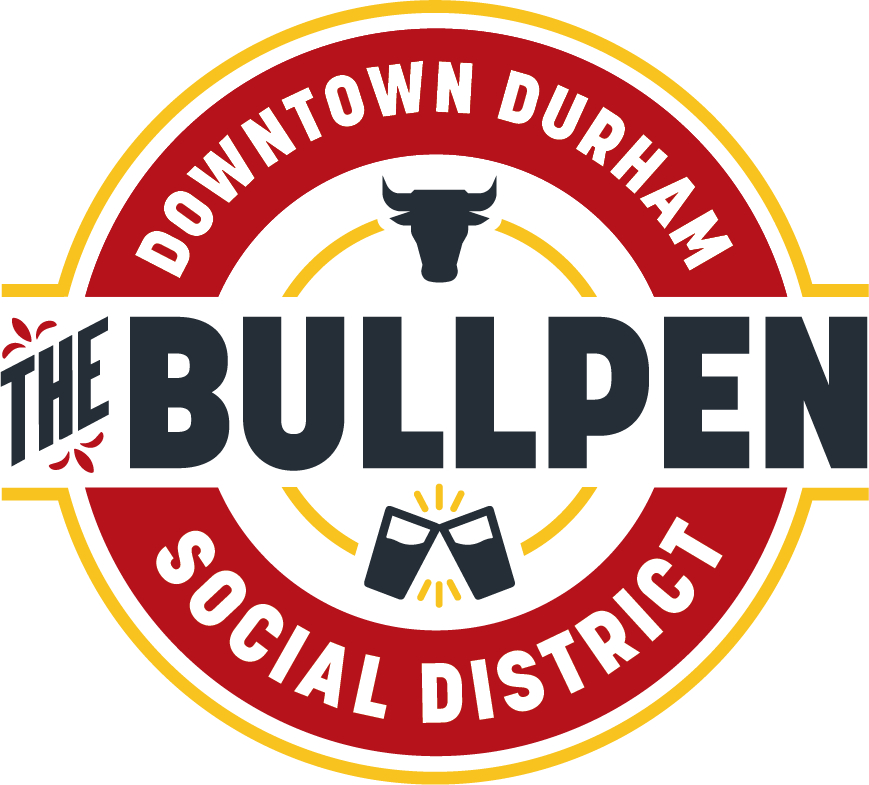
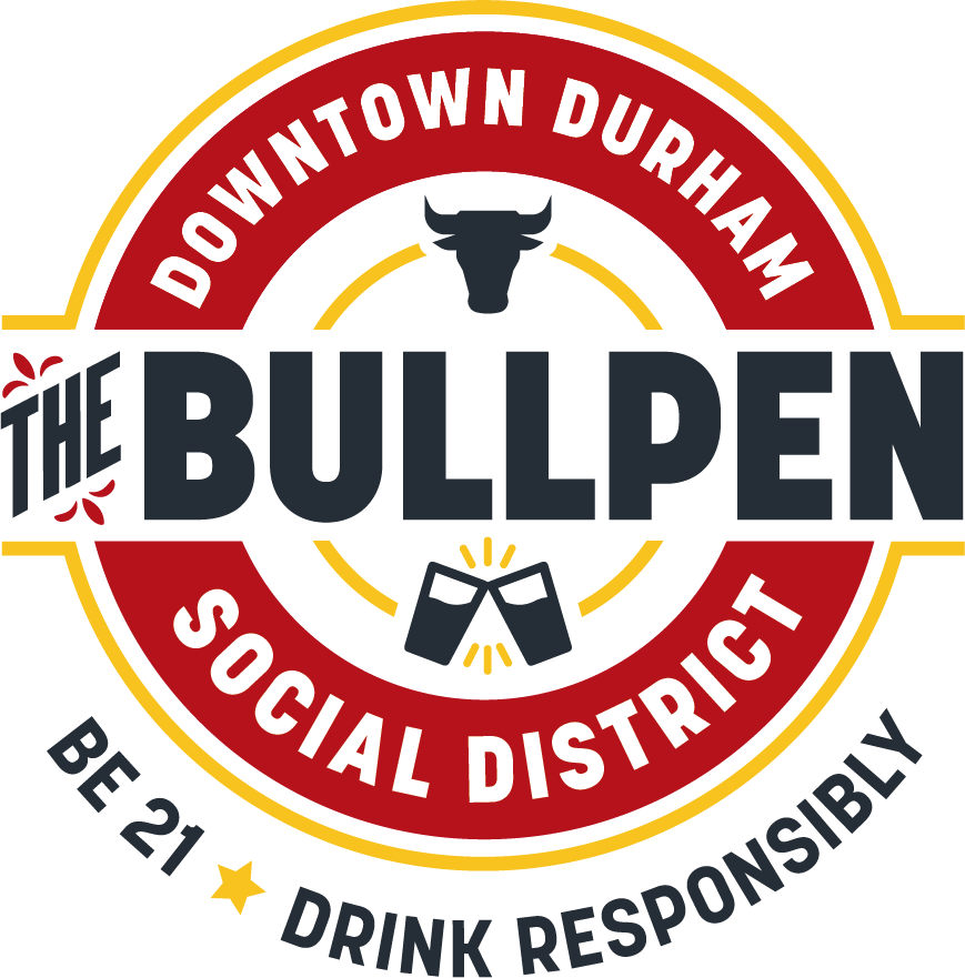
With that in mind, Downtown Durham’s brand colors became the basis for the social district’s. We brightened their burgundy and gold to more vibrant versions and included a dark charcoal gray to balance them out. These colors pop on signage, the primary deployment of the district’s branding.
The identity was an immediate hit amongst Downtown Durham employees and the city council. With the identity wrapped up, we moved swiftly forward into creating signage.
This project was produced at HALO 22. See the original post.
Art Direction: David Spratte, HALO 22
Design: Emily Combs, HALO 22